A single box which gives you a visual idea about 5 components in a dataset. It is also known as box and whiskers plot or simply box plot. It is useful for describing measures of central tendencies and measures of dispersion in a dataset.
Contributed by: Avantika Shukla
Box Plot represents the following points in a dataset.
- Minimum Value
- First Quartile (Q1 or 25th Percentile)
- Second Quartile (Q2 or 50th Percentile)
- Third Quartile (Q3 or 75th Percentile)
- Maximum Value
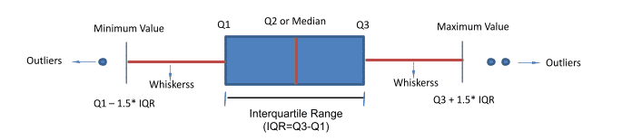
Along with the above 5 components. Boxplot also gives us below information:
- Outliers: Points lying beyond the minimum and maximum values are outliers
- Interquartile range: It is Q3-Q1. It is the spread or range of the middle 50% of the data.
- Whiskers: From Minimum Value to Q1 is the first 25% of data
From Q3 to Maximum value is the last 25% of the data
Let us understand box plot with an example. Suppose you have a dataset of runs scored by a batsman in his 12 matches. You arrange the dataset in descending order. Divide the dataset into 4 equal parts. Now how to find out 3 percentiles? 25th percentile, 50th percentile and 75th percentile of the boxplot. Percentile is the number below which a given percentage falls or you can also apply the below formula to find out the percentile.
Position of the number, for given percentile (Pn) =Percentile(N+1)/100
N= No. of items in the dataset
If the above result comes in float (in decimals) then, take the mean of 2 numbers of Pn and P(n+1)
If the result comes in integer, then take the value of Pn
In our example N = 12
Position number for 25th percentile= 25(12+1)/100= 3.25
The result is a decimal number, we will take mean of 3rd and 4th number
Position number for 50th percentile= 50(12+1)/100= 6.5
The result is a decimal number, we will take mean of 6th and 7th number
Position number for 50th percentile= 75(12+1)/100= 9.75
The result is a decimal number, we will take mean of 9th and 10th number
Let us visualize it:
- Q1 or 25th percentile = Number below which 25% is falling
- Q2 or 50th percentile = Number below which 50% is falling
Q3 or 75th percentile = Number below which 75% is falling
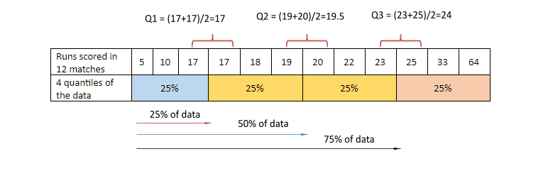
Q1=17
Q2=19.5
Q3=24
Interquartile range (IQR)=Q3-Q1=24-17=7
Minimum Value= Q1-1.5 * IQR=17-1.5*7=6.5
Maximum Value= Q3 +1.5 * IQR=24+1.5*7=34.5
Outliers of the dataset= 5 & 64
Let us impose all the points of the boxplot on a number line:
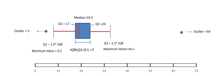
Boxplot also tells us about the distribution and symmetry of the data. The above example shows the data is right skewed. Interquartile range shows us that the middle 50% of the data lies between 17 runs to 24 runs. Whiskers of the box plot cover approximately 99.65% of the data.
Also Read: Python Tutorial For Beginners – A Complete Guide | Learn Python Easily
Graphing a boxplot using Python
Read the data.
The code below will import all the necessary libraries and will read the data:
import numpy as np
import pandas as pd
import matplotlib.pyplot as plt
import seaborn as sns
#Read the dataset RunScored.xlsx
df=pd.read_excel('RunScored.xlsx')
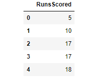
#Read top 5 rows
df.head()
Let us check the dimension of the data.
#Check the dimensions of the data
df.shape
The above result tells us that there are 12 rows and 1 column. This dataset contains runs scored in 12 matches.
Now let us see how to make boxplot with seaborn library:
#Plot boxplot with seaborn
sns.boxplot(x = 'RunsScored',color = 'violet',data = df);
The above result shows the player A has a median of 19.5, 2 outliers are also present in data. The middle 50% spread is between 17 to 24.
Now, let us compare runs scored by 2 players (Player A and Player B) through box plot.
Read the data:
#Reading 2nd database with 2 players to compare their runs scored using boxplots
df=pd.read_excel('RunScored2player.xlsx')
#Reading top 5 rows of the dataset
df.head()
Let us see the dimension of the dataset.
#Check the dimensions of the data
df.shape
The above result tells us that there are 12 rows and 2 columns. This dataset contains runs scored in 12 matches.
Let us plot the boxplot of runs scored by 2 players:
By the above plot we can deduce that the median of player B is greater than player A. IQR tells us the spread of Player B for middle 50% is higher. Even the Q3 and maximum value of player B is higher.
If you want to display the median on your boxplot you can make use of function box.annotate().
medians=[df.RunsScoredPlayerA.median(),df.RunsScoredPlayerB.median()]

box=sns.boxplot(data=df);
for i in range(2):
    box.annotate(str(medians[i]),xy=(i,medians[i]),horizontalalignment='center');
The above result shows the median of player A is 19.5 on the other hand median of player B is 25.
Similarly, we can also display Q1, Q3, Minimum value and Maximum value on the boxplot.
Q1=[df.RunsScoredPlayerA.quantile(.25),df.RunsScoredPlayerB.quantile(.25)]
Q3=[df.RunsScoredPlayerA.quantile(.75),df.RunsScoredPlayerB.quantile(.75)]
IQR=[(Q3[0]-Q1[0]),(Q3[1]-Q1[1])]
Min_value=[(Q1[0]-1.5*IQR[0]),(Q1[1]-1.5*IQR[1])]
Max_value=[(Q3[0]+1.5*IQR[0]),(Q3[1]+1.5*IQR[1])]

box=sns.boxplot(data=df);
for i in range(2):
    box.annotate(str(medians[i]),xy=(i,medians[i]),horizontalalignment='center');
    box.annotate(str(Q1[i]),xy=(i,Q1[i]),horizontalalignment='center');
    box.annotate(str(Q3[i]),xy=(i,Q3[i]),horizontalalignment='center');
    box.annotate(str(Min_value[i]),xy=(i,Min_value[i]),horizontalalignment='center');
    box.annotate(str(Max_value[i]),xy=(i,Max_value[i]),horizontalalignment='center');
Displaying values on the boxplot gives a more clear idea.
This brings us to the end of the blog on Understanding boxplot. Hope this helps you gain a better understanding of the same. If you wish to learn more such concepts, head over to Great Learning Academy and choose from a plethora of free online courses.