As data interpretation becomes increasingly critical, professionals are seeking ways to use visualization not merely for summarizing information, but as a powerful thinking tool to uncover deep patterns, relationships, and underlying meaning.
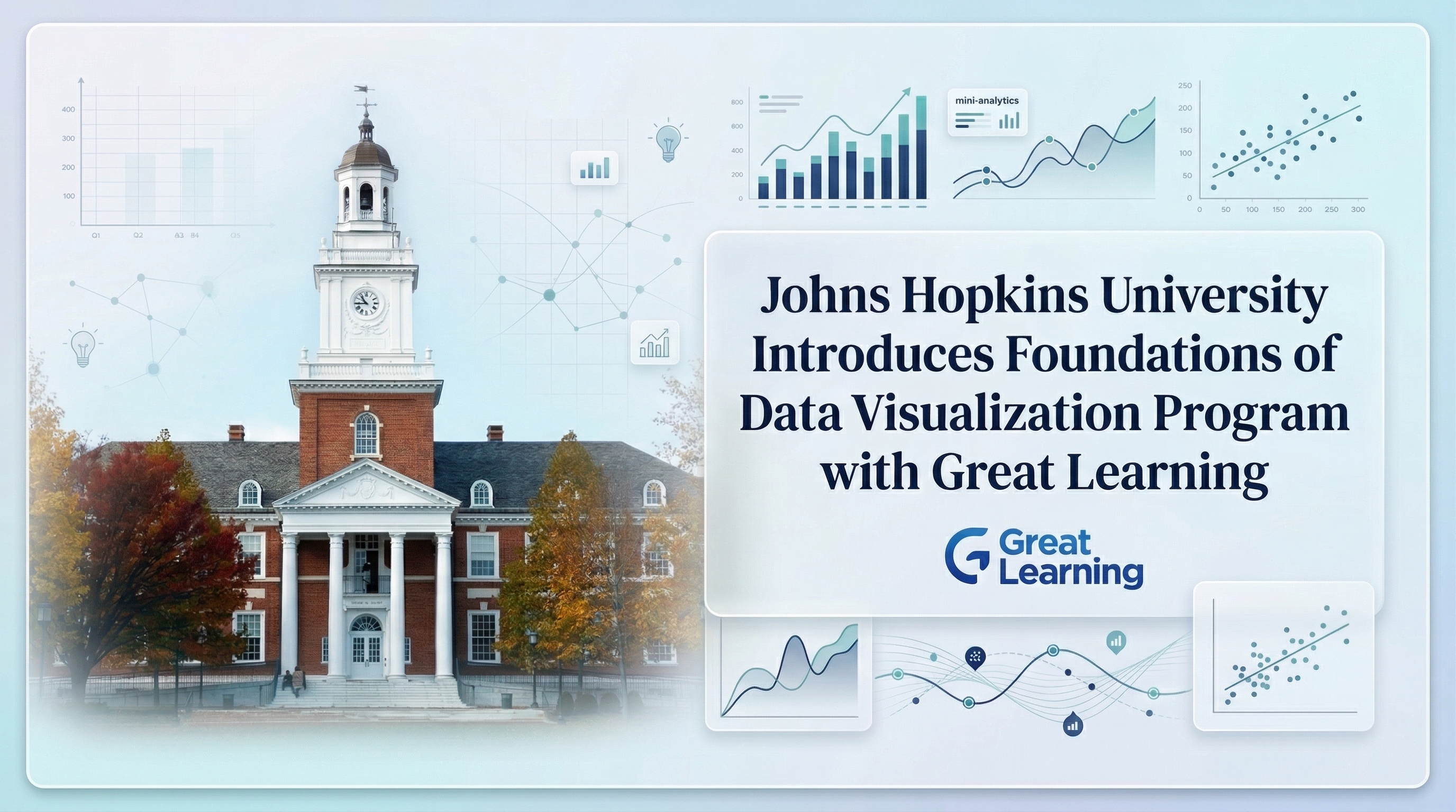
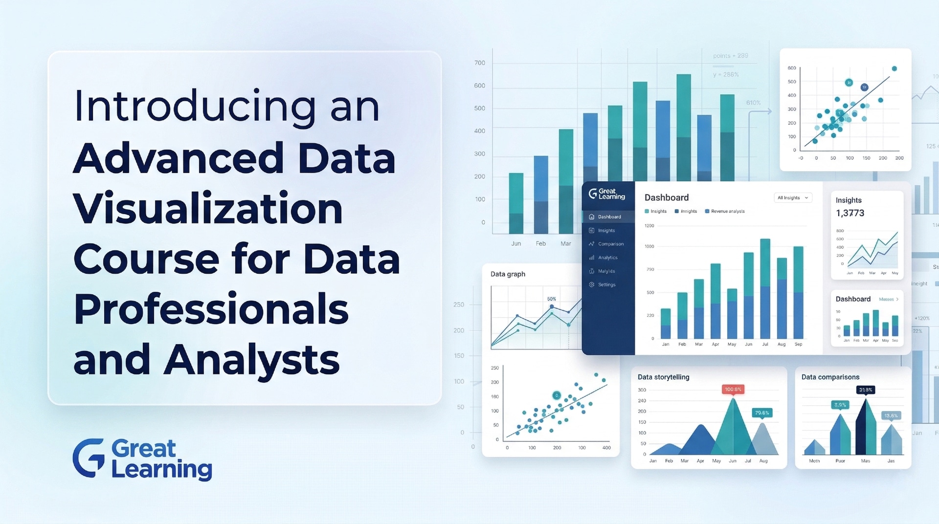
To address this need, Johns Hopkins Engineering Executive and Professional Education has launched the Advanced Techniques in Data Visualization course. Offered in partnership with Great Learning, this asynchronous, self-paced online program is designed to help learners build a versatile toolkit for data visualization.
By combining hands-on activities with advanced frameworks, the course trains participants to make sound judgments on which techniques best suit various data contexts while utilizing modern programming environments like Python.
About the Johns Hopkins Advanced Data Visualization Program
The Advanced Techniques in Data Visualization program is an asynchronous, 20+ hour online course. It is designed to help learners create visualizations that enable clear communication, exploration, and analytical reasoning in real-world contexts.
As the course content and practical assignments extensively incorporate Python and relevant frameworks, participants are expected to possess a foundational understanding of data visualization concepts and proficiency in Python programming prior to enrollment.
What Makes This Program Unique?
Johns Hopkins University (JHU) is a globally recognized institution that frequently ranks among the top 10 universities in the United States, offering a distinct advantage for continuing education.
1. Prestigious Academic Standing
JHU boasts exceptional global and national rankings, including:
- 6th National University (U.S. News & World Report 2025).
- 1st Computer Information Technology (U.S. News & World Report 2025).
- 13th Best Global University (U.S. News & World Report 2026).
2. Research-Driven Curriculum
The syllabus is firmly rooted in the newest research and advancements within the data visualization field, ensuring the material remains highly relevant. This is supported by JHU’s longstanding reputation as a top-tier institution for R&D.
3. Flexible Online Learning
Designed for busy professionals, the curriculum is delivered entirely online via an asynchronous, self-paced format spanning over 20 hours.
4. Hands-On Learning with Industry Tools
Beyond theory, the program emphasizes practical application through engaging Python assignments, required readings, and quizzes that directly enhance productivity and foster innovative approaches in their specific professional domains.
Who Should Enroll?
This specialized course is perfect for those aiming to transcend foundational visualization methods. It is specifically tailored for:
- Strategic Decision-Makers and Business Leads: Managers and stakeholders looking to convert complex data into clear strategies and measurable ROI through advanced visual storytelling.
- Business and Early-Career Data Professionals: Those wanting to map non-traditional or complex data, such as text and networks.
- Analysts and Researchers: Experts who rely on exploratory and interactive visualizations to reveal hidden insights.
- Tech Professionals: Individuals managing massive unstructured and structured datasets.
- Designers and Communicators: Creatives focused on anchoring their visual storytelling in solid cognition and perception principles.
What You Will Learn?
The program is broken down into 5 Strong modules:
Module 1: The Use of Color in Data Visualization
Understand how hue influences meaning. Key topics include:
- Role of Color in Human Perception and Communication.
- Applying RGB and CIELab Color Spaces to Visualization Design.
- Designing Color Encodings for Clarity and Accessibility.
Module 2: User Interaction in Data Visualization
Learn to build exploratory tools. Key topics include:
- Role of Interactivity in Data Exploration.
- Applying Interaction Techniques: Filtering, Zooming, Brushing, and Tooltips.
- Designing User-Centered Interactive Visualizations.
Module 3: Network Visualization
Tackle complex relationships. Key topics include:
- Representing Hierarchical and Networked Data Effectively.
- Selecting Appropriate Layouts for Graphs and Trees.
- Improving Readability with Clustering and Edge Bundling.
Module 4: Visualization and Maps
Master geospatial data. Key topics include:
- Visualizing Geospatial Data Responsibly.
- Understanding Map Projections, Scale, and Distortion.
- Designing Choropleth, Dot, and Flow Maps.
Module 5: Text Visualization
Turn language into insight. Key topics include:
- Treating Text as Data for Analytical Visualization.
- Visualizing Document Content, Evolution, and Relationships.
- Analyzing Conversations and Large Text Corpora.
Assignments
Practical, hands-on tasks form the core of the learning experience:
- Color in Context: Work with colormaps and complementary colors in Python to see how palette choices impact data perception.
- Interactive Insights: Utilize Altair or Plotly to create dynamic charts featuring sliders and dropdowns for enhanced data exploration.
- Networks & Trees: Deploy Plotly and NetworkX to map out structural hierarchies and relational connections.
- Data on the Map: Plot geographic locations utilizing hover information, spatial markers, and specific map projections to highlight location-based patterns.
- Visualizing Text: Cleanse text data and utilize word clouds, co-occurrence networks, and frequency charts to extract meaning from language.
Key Learning Outcomes
Upon finishing the curriculum, participants will be able to:
- Apply perceptual color theory and color spaces to enhance clarity, accessibility, and meaning.
- Design interactive visualizations that support exploration, filtering, and insight discovery.
- Represent hierarchical and networked data using appropriate visualization models.
- Visualize geospatial data accurately while accounting for projection, scale, and distortion.
- Analyze and visualize unstructured text data to uncover patterns, themes, and relationships.
- Select and apply advanced visualization techniques for diverse real-world data challenges.
Certification and Learning Ecosystem
To successfully pass the course, learners must attain a minimum score of 85 percent. Graduates will be awarded 2 Continuing Education Units (CEUs) alongside a globally recognized Certificate of Completion from Johns Hopkins University.
The course is facilitated by Great Learning, a premier ed-tech organization that manages technology support, invoicing, and enrollments. Great Learning has empowered over 14 million learners across more than 170 countries.
Next Step
Interested candidates can begin the enrollment process by registering through the official course page. After submitting the required details and completing the course fee payment, learners will receive a confirmation email with access credentials to the learning platform.
Once enrolled, participants can start the program at their convenience, explore module-wise content, and engage in hands-on assignments.