Struggling to organize data for effective decision-making? MIS reports in Excel can turn raw, scattered data into meaningful insights that help you:
- Monitor Performance
- Identify Trends
- Make Informed Business Decisions
In this tutorial, we will explore not only how to structure and format these reports for clarity and efficiency but also best practices and practical examples to streamline your reporting process and enhance data-driven decision-making.
What Are MIS Reports in Excel and Why Are They Important?
MIS reports provide businesses with an easy method of reviewing, analyzing, and managing their operations.
Through the flexibility of Excel formulas and visualization tools, such as charts and tables, these reports can transform raw data into structured, easily comprehensible information, enabling easier decision-making and performance monitoring.
These reports are essential because they:
- Turn raw data into clear, actionable insights using intuitive charts and graphs.
- Boost operational efficiency by quickly identifying areas for improvement.
- Support smarter strategic planning and track performance effectively.
- Keep reporting consistently and efficiently to understand across all teams.
Learn Excel the smart way! Our course teaches you all the essential tools and techniques to master spreadsheets, from formulas to charts, and improve your workflow in every task you do.
Types of MIS Reports in Excel (with Examples)
1. Routine / Periodic Reports
These are regularly generated reports (daily, weekly, monthly, or quarterly) that provide a snapshot of ongoing business activities and performance.
2. On-Demand / Ad-Hoc Reports
These are created for specific queries or one-time analysis. They are not generated on a fixed schedule but when specific information is needed.
3. Exception Reports
These highlight unusual data patterns, anomalies, or deviations from the expected performance, helping management take corrective action quickly.
4. Dashboard Reports
These high-level, visual reports combine multiple metrics in a single view using charts, KPIs, and interactive elements like slicers or dropdowns.
Step-By-Step Example
Example 1: Building an Interactive Regional Sales Report
Objective: We will take raw sales data and turn it into an interactive dashboard that lets you filter revenue by product category.
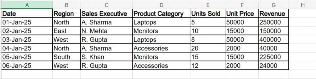
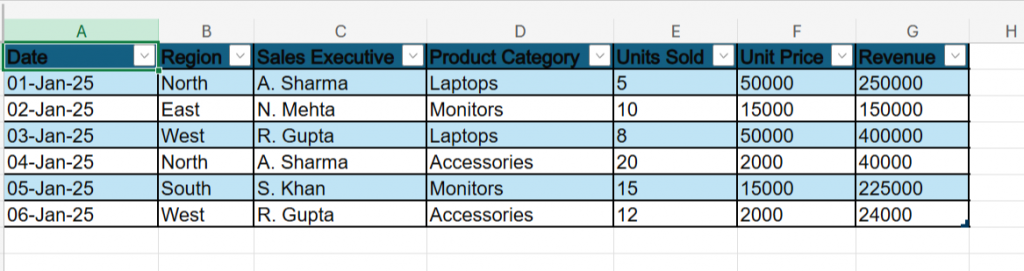
The Sample Data
The Step-by-Step Actions
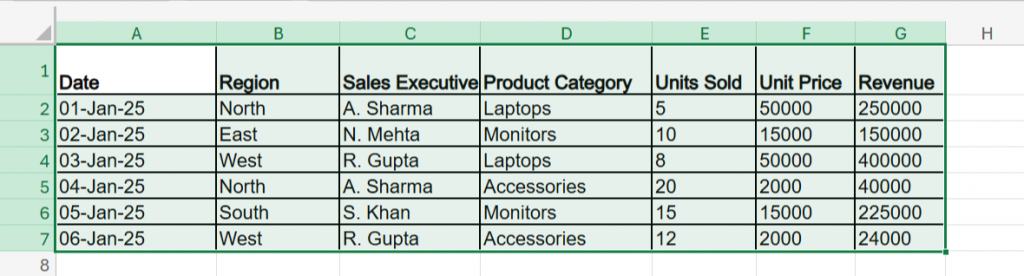
Step 1: Format as Table
- Select all the data (cells A1 to G7).
- Press Ctrl + T on your keyboard. (Note for Web Users: If you are using Excel Online, press Ctrl + L instead, as Ctrl + T will open a new browser tab.)
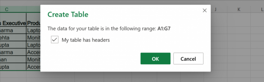
- Ensure "My table has headers" is checked and click OK.
Step 2: Insert the Pivot Table
- Click anywhere inside your new table, for example, (Date).
- Go to the Insert tab on the top ribbon and click PivotTable.
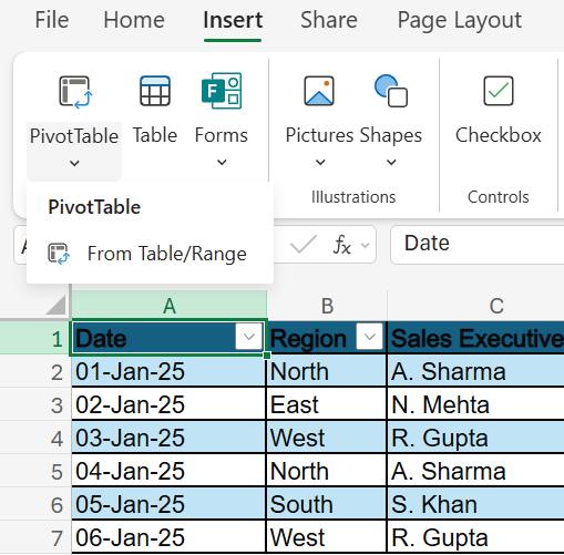
- Select "New Worksheet" and click OK.
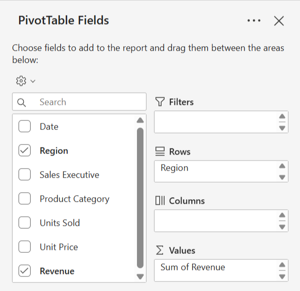
Step 3: Arrange the Metrics
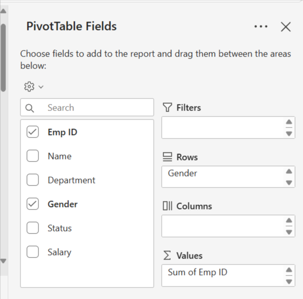
- A "PivotTable Fields" pane will appear on the right side of your new worksheet screen.
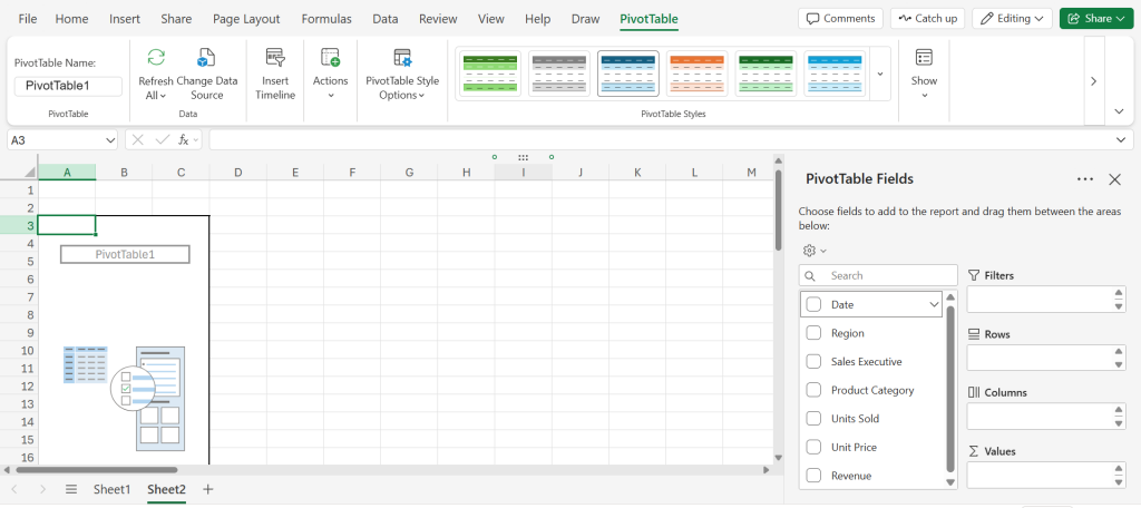
- Drag the Region into the Rows area.

- Drag Revenue into the Values area.
- Formatting the numbers makes them readable, so right-click any number in the "Sum of Revenue" column, select Number Format, choose Currency (or Accounting), and click OK.

Step 4: Create the Visuals
- Click inside your Pivot Table.
- Go to the Insert tab and select a Clustered Column Chart (the first option under 2-D Column).
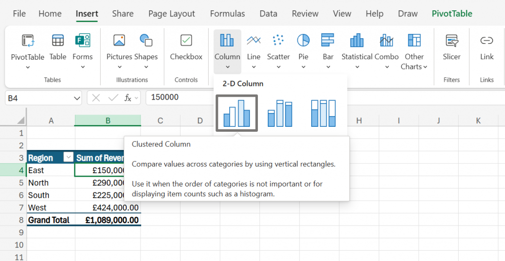
- Move the chart to the right of your table so it doesn't cover your data.
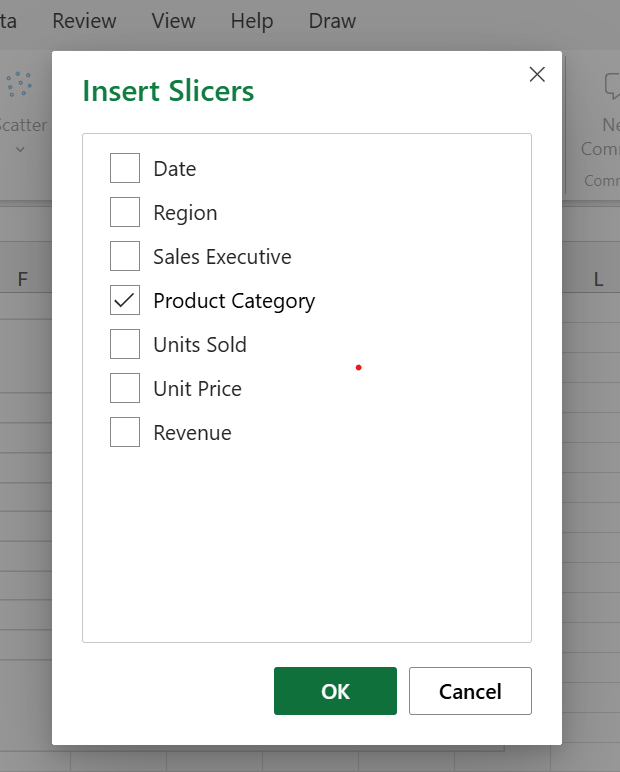
Step 5: Add the "Slicer"
- Click inside your Pivot Table again.
- Go to the PivotTable Analyze tab on the ribbon (or the Insert tab if using Excel Online) and click Insert Slicer.
- Click Insert Slicer and check the box for Product Category, and click OK.
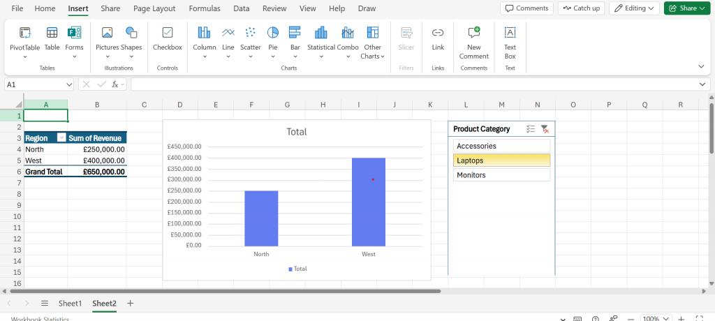
The Final Result
You will now see three distinct elements on your screen:
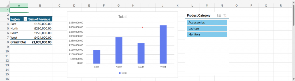
- Summary Table (Left): A concise table showing Total Revenue per Region (East, North, South, West).
- Chart (Center): A bar graph visually comparing the revenue of each region.
- Slicer (Right): A floating box listing your products ("Accessories", "Laptops", "Monitors").
Try it out:
Click "Laptops" in the Slicer. You will see both the Table and the Chart instantly update to show only the revenue from Laptops, hiding all other data.
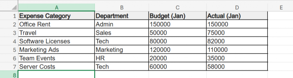
Example 2: Finance MIS - The "Budget vs. Actual" Exception Report
Objective: Create a report that automatically highlights expenses that have exceeded the budget, allowing management to spot financial risks instantly.
The Sample Data
The Step-by-Step Actions
Step 1: Calculate the Variance
- In cell E1, type the header Variance.
- In cell E2, enter the formula: =D2-C2 (Actual minus Budget).
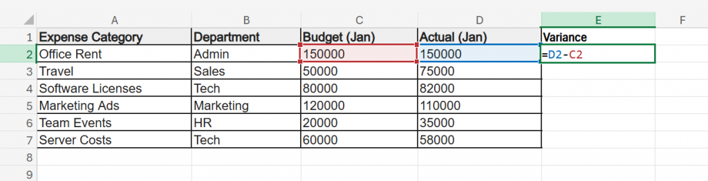
- Drag this formula down for all rows.
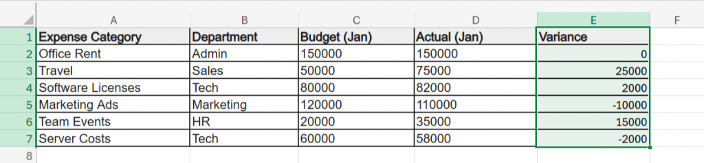
- Result: Positive numbers mean you spent too much; negative numbers mean you saved money.
Step 2: Calculate Variance % (The Key Metric)
- In cell F1, type the header Over Budget %.
- In cell F2, enter the formula: =E2/C2.
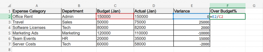
- Drag down and click the % button on the Home ribbon to format it as a percentage.
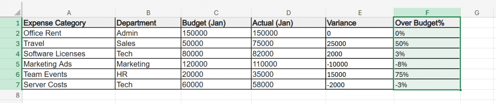
Step 3: Add Alerts (Conditional Formatting)
- Select the data in your "Over Budget %" column (F2:F7).
- Go to Home > Conditional Formatting > Highlight Cell Rules > Greater Than.
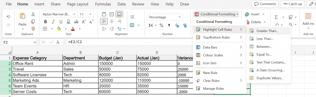
- Type 0 and select "Light Red Fill with Dark Red Text" and click OK.
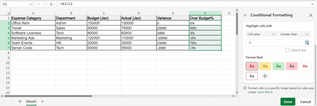
Result: Cells that show a positive percentage, meaning the spending is higher than the budget, will automatically turn light red with dark red text.
Based on your sample data, these three items will light up:
- Travel
- Team Events
- Software Licenses
Any item that is on budget or saved money remains uncolored, which includes:
- Office Rent
- Marketing Ads
- Server Costs
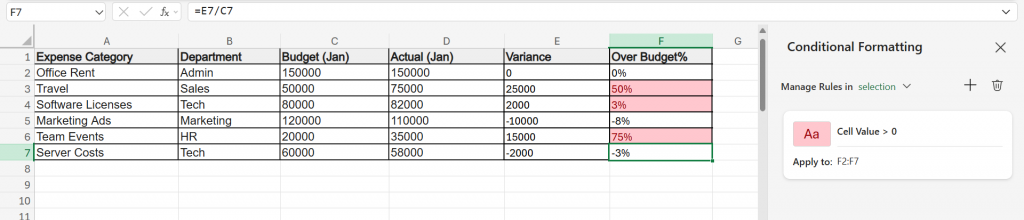
You now have a self-auditing report.
Example 3: HR MIS - The Headcount and Diversity Dashboard
Objective: Summarize employee data to track total active headcount and gender diversity ratios for the entire organization, replacing manual counting with automation.
The Sample Data
The Step-by-Step Actions
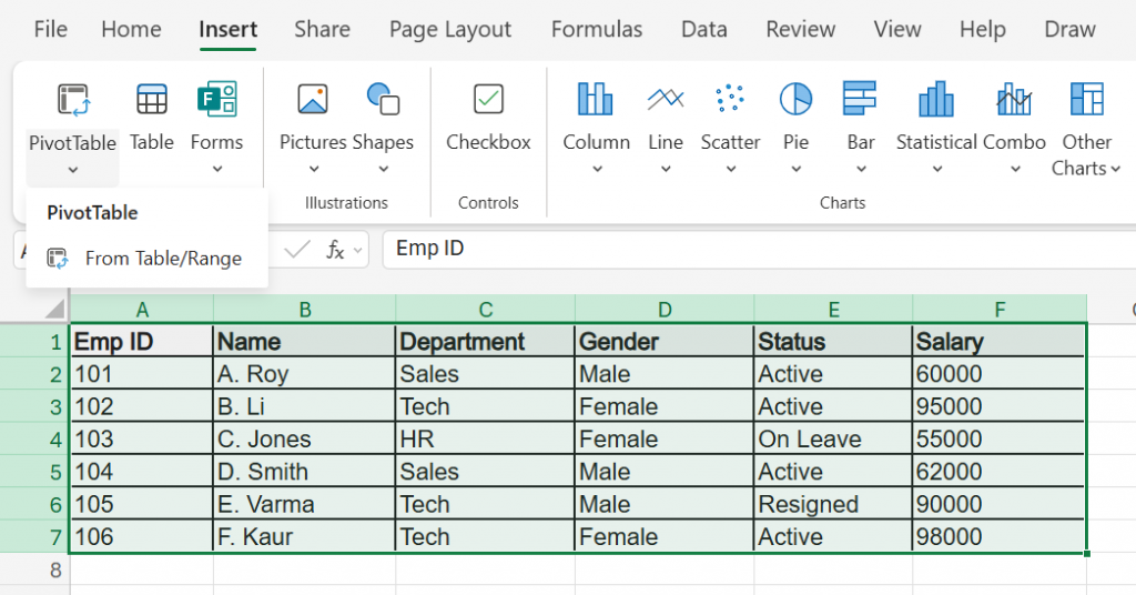
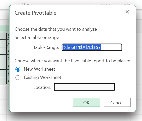
Step 1: Create the Pivot Table
- Select the data (A1:F7) and go to Insert > PivotTable > New Worksheet > OK.
Step 2: Build the "Headcount by Gender" View
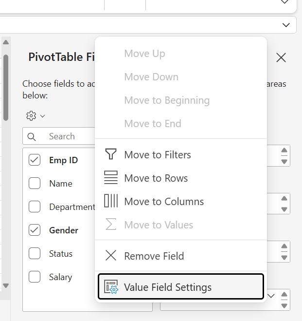
- Drag Gender into the Rows area and Emp ID into the Values area.
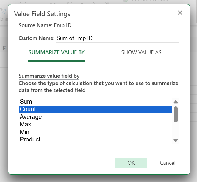
- Important: Since the Values area shows ‘Sum of Emp ID’, we need to change it to ‘Count’. To do this, click on it > select Value Field Settings > choose Count > click OK.
Step 3: Add a "Diversity" Chart
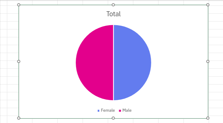
- Click inside your Pivot Table and go to Insert > Charts > Pie Chart (or "Doughnut Chart"). This creates a visual snapshot comparing the portion of Male vs. Female employees.
Step 4: Filter for Active Employees Only
- Drag Status into the Filters area of the Pivot pane.
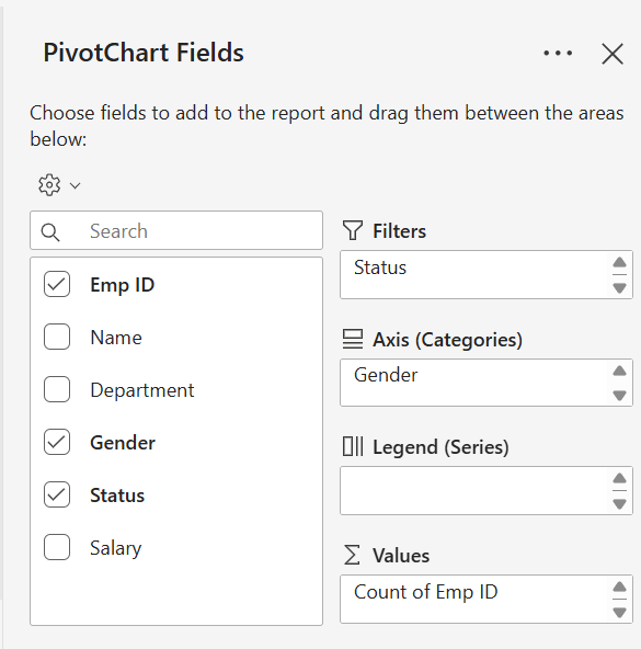
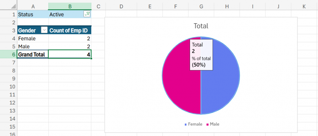
- A filter dropdown appears above your table (usually cell B1). Click it and select "Active".
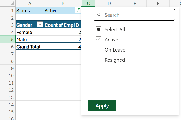
- Verify the Result: Your chart may still look like a 50/50 split (because the remaining staff is equal: 2 Males, 2 Females).
To confirm the filter worked, check that your Table's Grand Total dropped from 6 to 4.
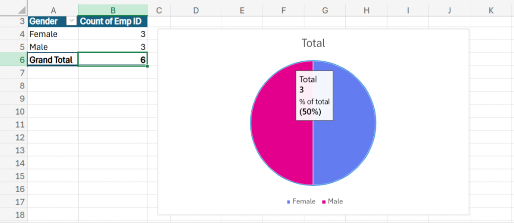
3. The Final Result
- The Matrix: You have a clean summary table showing exactly how many Active Males and Females are in the company.
- The Visual: A Pie Chart visually showing the gender ratio (e.g., 50% Male, 50% Female).
- The Control: If you change the filter to "Resigned," both the table and the chart instantly update to show attrition data instead of current headcount.
Best Practices For Effective MIS Reporting In Excel
1. Maintain Data Consistency and Structure:
Ensure that your raw data is well-organized, consistently formatted, and error-free. You should use:
- Standardized Date Formats
- Column Headings
- Naming Conventions
So that your formulas, PivotTables, and charts work seamlessly across the report.
Learn Excel for powerful data analysis and enhance your skills for better decision-making.
2. Use Excel Functions and Formulas Efficiently:
Use built-in Excel functions such as:
- VLOOKUP
- SUMIFS
- IF
- INDEX/MATCH
To automate tasks and minimize human interaction. This saves time and reduces the risk of human error.
3. Incorporate Data Visualization Wisely:
Make complicated data easier to comprehend through the use of:
- Charts
- Graphs
- Conditional Formatting
Select the right visualization tools, e.g., bar charts for comparing or line charts for trend, and do not overload your dashboard with redundant visuals.
4. Keep Your Report User-Friendly and Navigable:
Structure your MIS report to be easy to read and understand for stakeholders. Key techniques include:
- Descriptive Headings
- Freeze Panes
- Cell Formatting
- Table Of Contents Or Clickable Hyperlinks To Enhance Across-Sheet Navigation
5. Protect and Version-Control Your Files:
Enable sheet protection and restrict editing access to prevent accidental modifications. Additionally, implement a version control system (e.g., naming files with dates or version numbers) to track updates and maintain the integrity of your MIS reports over time.
Refine your Excel skills and streamline your MIS reporting by enrolling in our Free Excel Tips and Tricks course.
Common Mistakes In MIS Reports And How to Fix Them
1. Hardcoding Numbers in Formulas
The Mistake:
Typing static numbers directly into formulas (e.g., =B2*0.18 (or =B2*18%)) instead of referencing a cell.
- Why it fails: If the tax rate changes to 20%, you have to find and fix every formula manually, increasing the risk of errors.
- The Fix: Create a separate "Input Table" for variables like Tax Rate or Targets. Reference that cell (e.g.,=B2*$H$1). When the rate changes, you update a single cell, and the entire report updates automatically.
2. Ignoring Data Validation (The "Garbage In" Problem)
The Mistake:
Allowing users to type free text (like "North", "north", or "N. Zone") into data columns.
- Why it fails: Excel sees "North" and "north " (with a space) as two different regions, breaking your Pivot Tables and formulas.
- The Fix: Use Data Validation (Data Tab > Data Validation). Create a dropdown list of allowed regions so users can only select valid options.
3. Leaving Error Messages (#DIV/0!, #N/A) Exposed
The Mistake:
Presenting a report to management that is littered with #DIV/0! or #N/A errors because data is missing for a specific month.
- Why it fails: It looks unprofessional and makes the report hard to read.
- The Fix: Wrap your formulas in the IFERROR function.
- Bad: =C2/D2
- Good: =IFERROR(C2/D2, 0) or =IFERROR(C2/D2, "-")
- Result: If an error occurs, Excel shows a clean "0" or hyphen instead of an ugly error code.
4. Overloading the Dashboard
The Mistake:
Cramming too many charts, colors, and 3D effects into one view.
- Why it fails: "Chart Junk" distracts from the key insights. Decision-makers shouldn't have to hunt for the story.
- The Fix: Stick to the "5-Second Rule." A manager should be able to understand the trend within 5 seconds. Use clean 2D bar charts or line graphs and remove unnecessary gridlines and borders.
5. Merging Cells Aggressively
The Mistake:
Merging cells (e.g., A1 to E1) to center a title over a dataset.
- Why it fails: Merged cells often prevent you from sorting, filtering, or selecting data columns properly later on.
- The Fix: Use "Center Across Selection" instead.
- How: Select cells A1:E1 > Right Click > Format Cells > Alignment Tab > Horizontal > Center Across Selection.
- Result: It looks merged, but each cell remains separate and functional.
As businesses increasingly rely on analytics, professionals with strong data interpretation and reporting skills are in high demand.
Many common MIS reporting errors stem from gaps in core Excel knowledge like incorrect formulas, poor formatting, or unfamiliarity with functions. If you want a structured way to build confidence and avoid these pitfalls, consider enrolling in this Free Excel course designed especially for beginners.