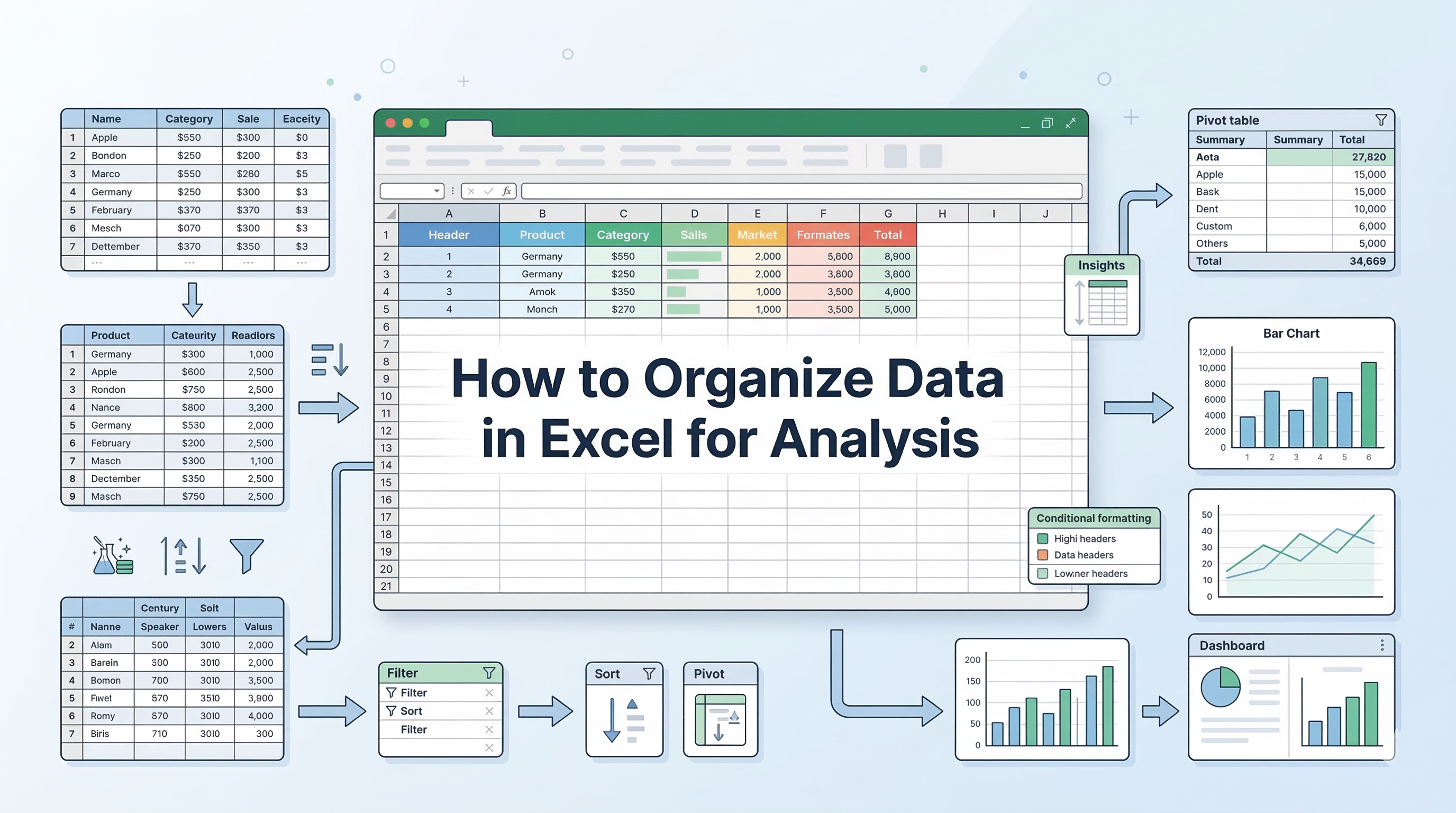
- The Foundational Sample Dataset
- Essential Formulas for High-Speed Analysis
- Powerful Excel Tool for Large-Scale Datasets
- 1. Build Automated PivotTables for Instant Summaries
- 2. Visualize Dynamic Data with Pivot Charts
- Build Interactive Dashboards with Slicers
- Keyboard Shortcuts for Workflow Speed
- Modern Techniques for Data Preparation
- Validating Your Findings with Visuals
- Conclusion
Excel remains one of the most powerful tools for data analysis, but only if you know how to use it efficiently. Many professionals still rely on manual processes, which not only slow down workflows but also increase the risk of errors.
While a quick reference guide can help you get started, mastering Excel truly requires hands-on learning and real-world application.
This is where Great Learning’s Master Data Analytics in Excel course makes a difference. It covers advanced formulas, PivotTables, and analytical tools through practical business scenarios, helping you move beyond basic usage to building accurate, scalable data models.
Learn Excel for powerful data analysis and enhance your skills for better decision-making.
However, if you're looking to improve your workflow immediately, here’s a structured breakdown of the essential Excel tools and formulas you need to turn raw data into meaningful insights efficiently.
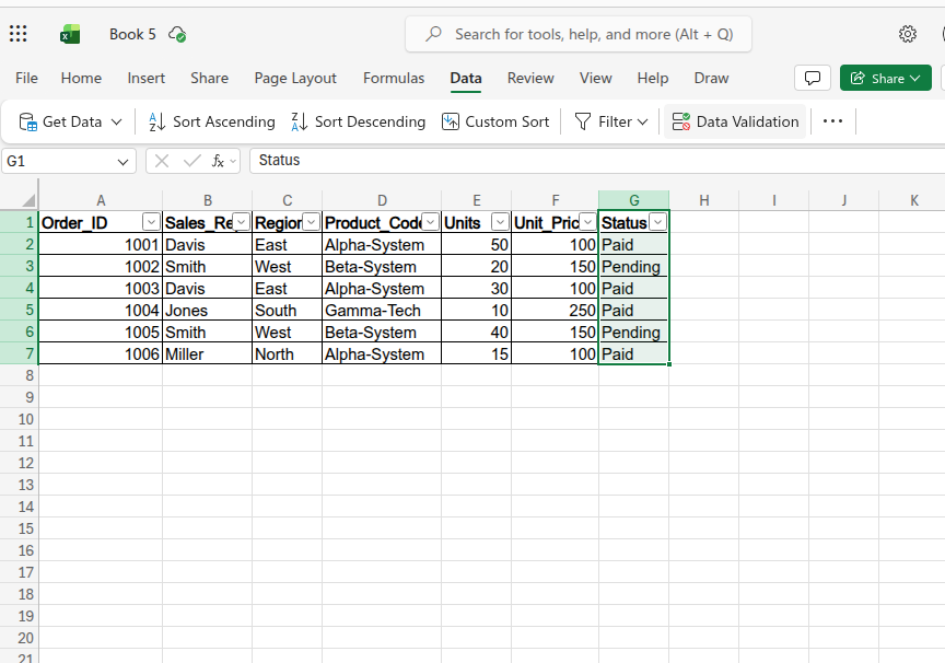
The Foundational Sample Dataset
To understand how these formulas work in reality, you need a realistic set of numbers. Copy and paste the table below exactly into cell A1 of a blank spreadsheet. We will use this exact data to execute every data analysis command in Excel covered throughout this guide.
| Order_ID | Sales_Rep | Region | Product_Code | Units | Unit_Price | Status |
| 1001 | Davis | East | Alpha-System | 50 | 100 | Paid |
| 1002 | Smith | West | Beta-System | 20 | 150 | Pending |
| 1003 | Davis | East | Alpha-System | 30 | 100 | Paid |
| 1004 | Jones | South | Gamma-Tech | 10 | 250 | Paid |
| 1005 | Smith | West | Beta-System | 40 | 150 | Pending |
| 1006 | Miller | North | Alpha-System | 15 | 100 | Paid |
Essential Formulas for High-Speed Analysis
Before exploring complex automation, you must become proficient in the logical formulas that act as the engine of your spreadsheet. These functions allow you to query thousands of rows of data instantly. By applying these specific Excel commands for data analysis, you eliminate the massive risk of human error.
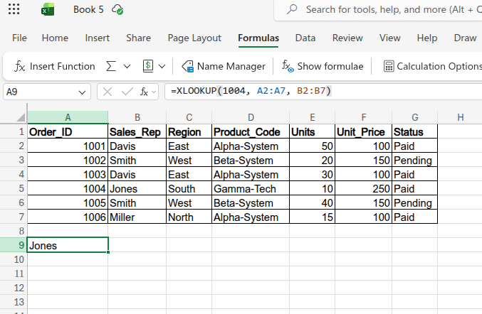
1. Execute XLOOKUP For Superior Searches
You must stop using VLOOKUP and transition to XLOOKUP for all your data retrieval tasks. This modern function looks in any direction and handles missing data natively without throwing broken errors.
- Formula: =XLOOKUP(1004, A2:A7, B2:B7)
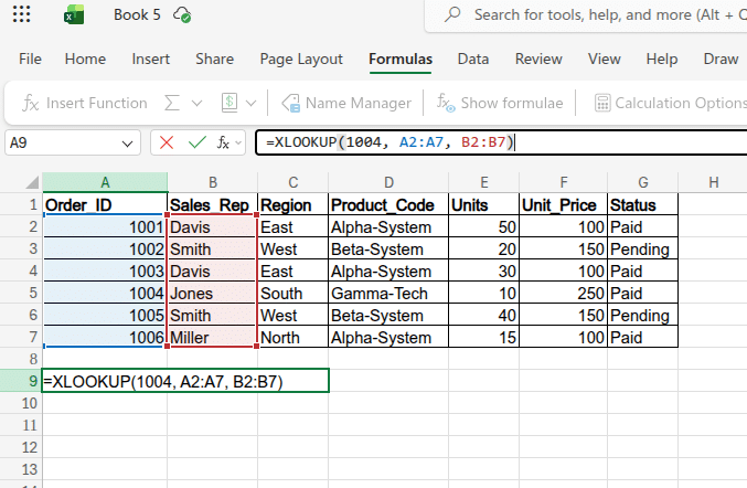
- Explanation: This searches for Order 1004 in Column A and returns the exact corresponding Sales_Rep from Column B.
- Output: Jones
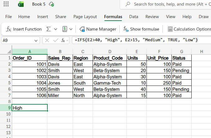
2. Apply IFS for Multi-Tiered Logic
You need to replace nested IF statements with the IFS function to test multiple conditions in a single, clean string. Nested statements are notoriously difficult to audit and often lead to circular reference errors.
- Formula: =IFS(E2>40, "High", E2>15, "Medium", TRUE, "Low")
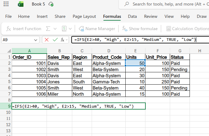
- Explanation: This checks the "Units" column (cell E2) and instantly assigns a volume tier to the order based on the quantity sold.
- Output: High (Because the 50 units in E2 is greater than 40. If applied to E5, it would output Low).
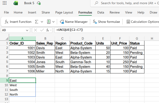
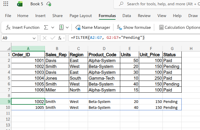
3. Utilize UNIQUE and FILTER for Dynamic Reporting
You should implement Dynamic Array functions to automatically spill results into multiple empty cells. They ensure that your summary tables update instantly as your primary data source grows.
- Formula (UNIQUE): =UNIQUE(C2:C7)
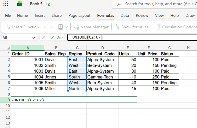
- Output (UNIQUE): A vertical list instantly displaying East, West, South, and North without any duplicates.
- Formula (FILTER): =FILTER(A2:G7, G2:G7="Pending")
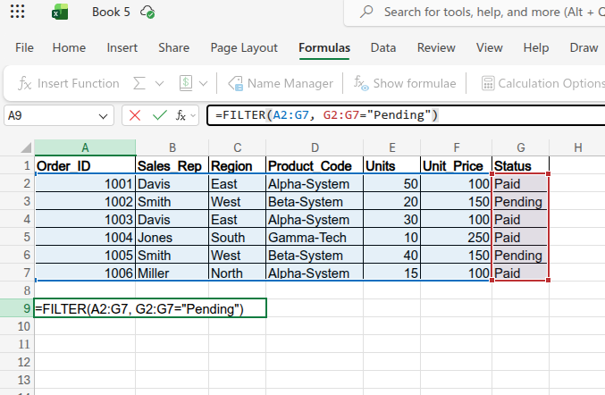
- Output (FILTER): A dynamic table that pulls the entire rows for Order 1002 and Order 1005, leaving out the paid orders.
Building automated reporting systems requires a flawless understanding of basic spreadsheet architecture. If you lack a firm grasp on absolute cell referencing and core aggregations, your complex formulas will inevitably fail.
You can watch our Microsoft Excel Tutorial for beginners video to cover all the basics and improve your understanding.
Powerful Excel Tool for Large-Scale Datasets
While formulas handle cell-level logic, built-in tools manage the architecture of your entire data project. Triggering the right data analysis command excel professionals use allows you to see patterns completely invisible in raw rows. The ultimate tool for this structural analysis is the PivotTable.
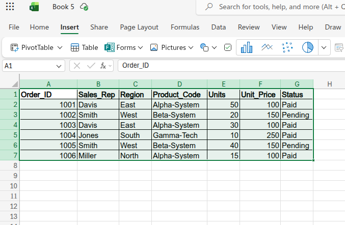
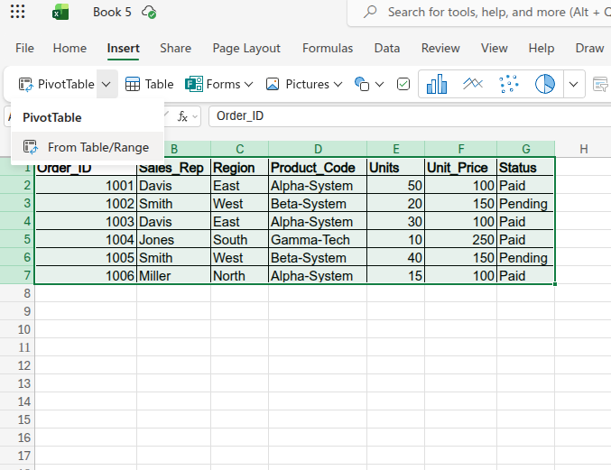
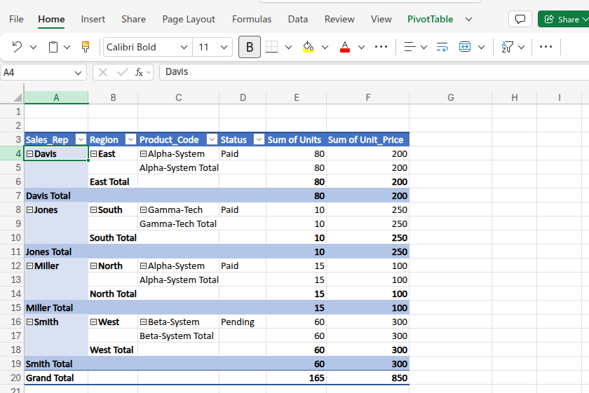
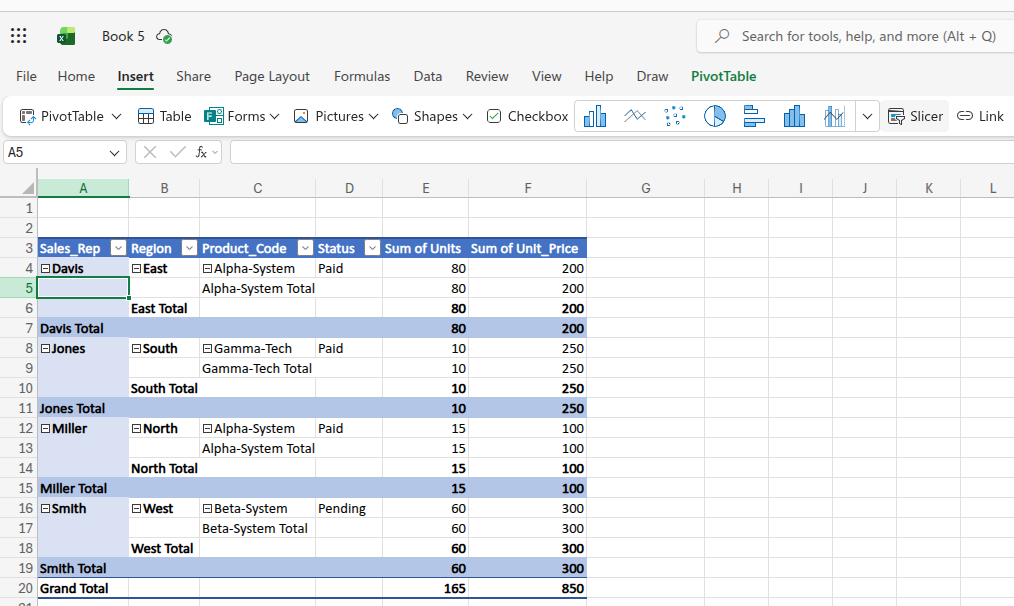
1. Build Automated PivotTables for Instant Summaries
You must leverage PivotTables to instantly summarize massive transaction logs. It allows you to transform thousands of rows into a concise table showing total revenue by specific regions.
This completely eliminates the need to manually calculate group totals or write complex aggregation formulas from scratch.
- Highlight A1:G7, click the Insert tab, select PivotTable, and drag "Region" into the Rows field and "Units" into the Values field to see total sales volume per territory.
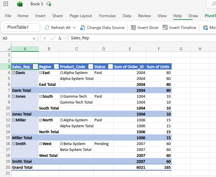
- This provides executives with a high-level overview without exposing them to raw data clutter.
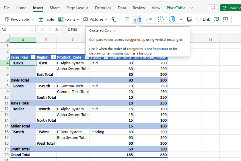
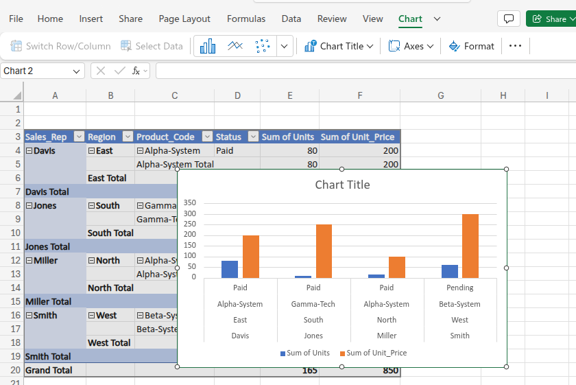
2. Visualize Dynamic Data with Pivot Charts
Raw summary tables are great, but executives respond best to visual trends. Pivot Charts connect directly to your PivotTables to create dynamic, interactive visual summaries.
- Click anywhere inside your active PivotTable, navigate to the standard Insert tab on the top ribbon, and click on any chart icon (like a Column or Pie chart). Excel automatically recognizes the underlying data and generates a dynamic Pivot Chart right on your grid.
- You can easily add visual slicers to the chart, allowing users to filter by "Sales_Rep" or "Status" with a single click.
- It turns static spreadsheets into interactive dashboards that automatically update whenever your underlying PivotTable changes.
Build Interactive Dashboards with Slicers
Modern Excel workflows are shifting away from clunky, hidden column filters toward intuitive, interactive dashboards. Slicers act as visual, clickable buttons that filter your tables and PivotTables in real-time, making your data highly accessible to executives.
- Click anywhere inside your active PivotTable, navigate to the Insert tab on the web ribbon, and click Slicer.
- Select a category like "Region" or "Sales_Rep" from the menu. Excel will generate a clean, floating dashboard of buttons right on your grid. Click "East," and your entire PivotTable and attached Pivot Charts instantly update to show only East Coast sales.
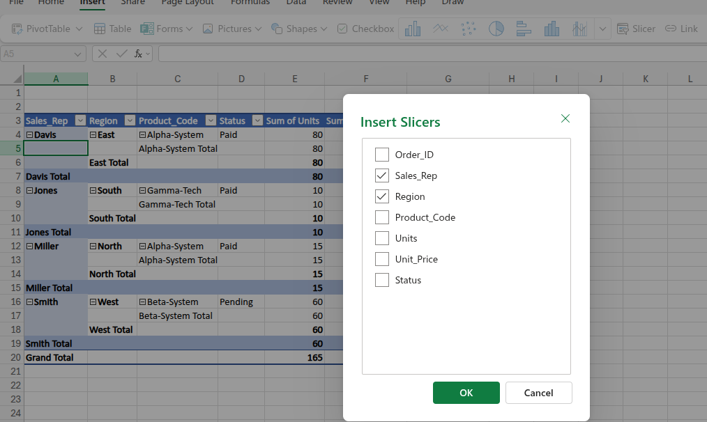
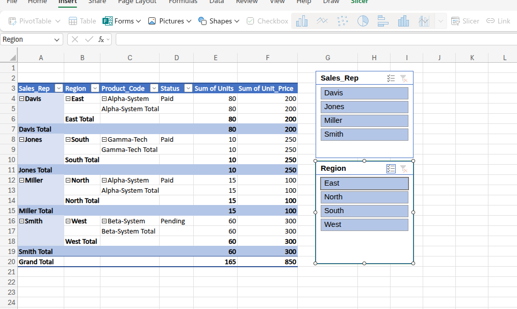
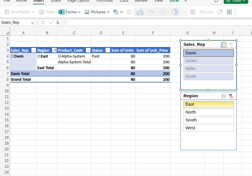
- It replaces outdated dropdown menus with a highly professional, user-friendly interface that anyone can use to uncover trends instantly, without needing a lick of Excel training.
Keyboard Shortcuts for Workflow Speed
Reducing your reliance on the computer mouse allows you to work significantly faster while building complex financial models, and keyboard shortcuts are essential in that regard.
- Ctrl + Shift + L: Instantly toggles filters on and off for your currently selected table.
- Alt + A + C: Clears all active filters in a worksheet so you can view the full dataset again.
- Alt + N + V: The absolute fastest way to create a PivotTable from your current selection.
- F4: Instantly toggles a cell reference between relative, absolute, and mixed (e.g., turning A1 into $A$1) while writing formulas.
- Ctrl + Arrow Keys: Jumps your cursor to the very edge of your data range, instantly navigating massive tables.
- Alt + = : Triggers AutoSum, instantly wrapping the adjacent numbers in a SUM function without typing a single letter.
- Ctrl + 1: Opens the Format Cells dialog box instantly, allowing rapid changes to number types, borders, and alignment.
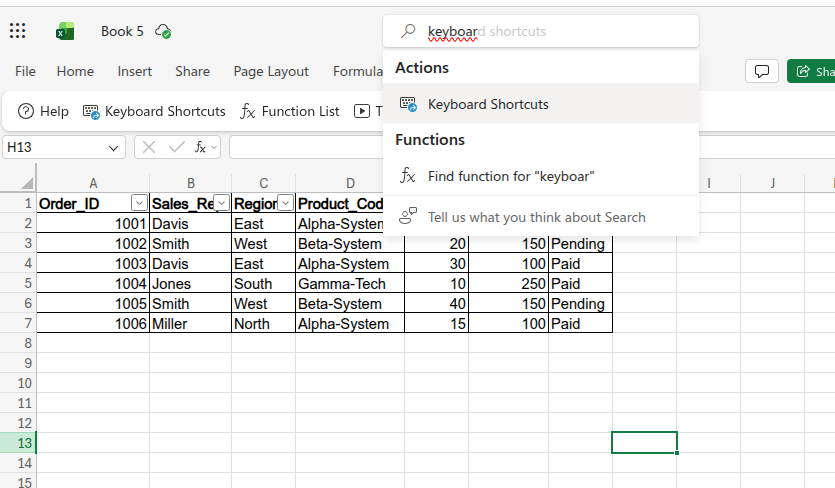
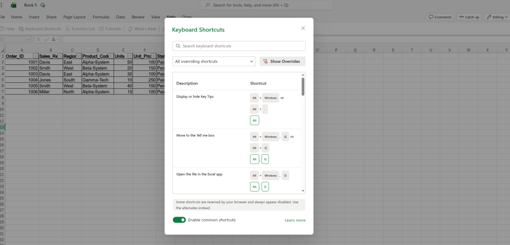
To view all Excel Online shortcuts and prevent browser conflicts, press Alt + Q and type "Keyboard Shortcuts" into the search bar. When the menu opens, be sure to check "Override browser shortcuts," so your complex commands execute flawlessly.
Modern Techniques for Data Preparation
Modern functions let you clean datasets in seconds, rather than wasting hours manually retyping text. Let’s look at how:
1. Split Text Seamlessly
You frequently need to separate combined strings into individual highly organized columns. TEXTSPLIT is the highly efficient, modern way to do this without relying on the outdated "Text to Columns" wizard.
- Formula: =TEXTSPLIT(D2, "-")
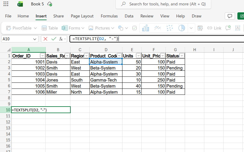
This takes "Alpha-System" from our dataset and neatly places "Alpha" and "System" into adjacent cells.
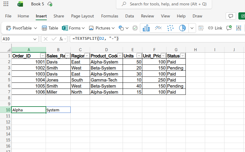
- It instantly standardizes messy text strings imported from older corporate databases.
2. Extract Patterns Instantly with Flash Fill
When formulas feel like overkill for simple text formatting, Flash Fill uses machine learning to recognize your typing pattern and finish the job for you.
- In the empty column right next to your data (cell H2), manually type a combined label exactly how you want it to look, such as 1001 - Davis (combining the Order_ID and Sales_Rep). Press Enter to move to the next row, then press Ctrl + E.
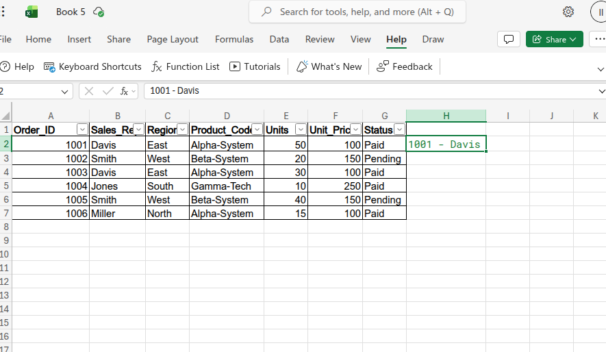
- Excel instantly recognizes the pattern you established and fills the entire column automatically with the correct corresponding data (e.g., 1002 - Smith, 1003 - Davis).
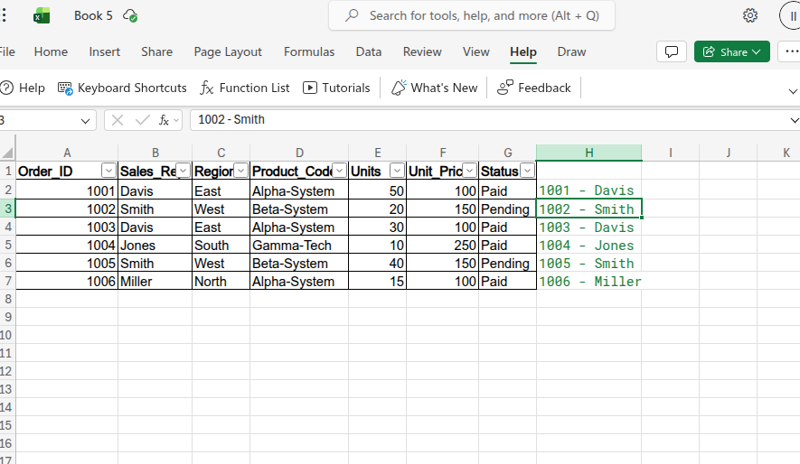
- It is the absolute fastest way to extract, format, or combine text strings without writing clunky LEFT, RIGHT, or CONCATENATE formulas.
3. Optimize Performance with the LET Function
If you have a complex formula that calculates the same mathematical step multiple times, you are wasting processing power. The LET function allows you to assign names to calculation results inside a formula.
- Formula: =LET(TotalRevenue, E2*F2, IF(TotalRevenue>=5000, "Bonus", "Standard"))
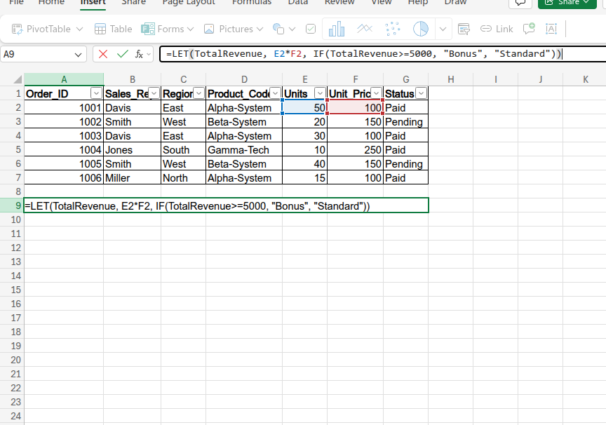
- We define the variable "TotalRevenue" once (which equals 5,000 for row 2), and then reuse that name in our logical test. Because 5,000 is greater than or equal to our threshold, it awards the bonus.
- Output: Bonus
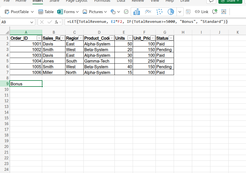
- It drastically speeds up calculation times on large spreadsheets and makes your complex formulas human-readable.
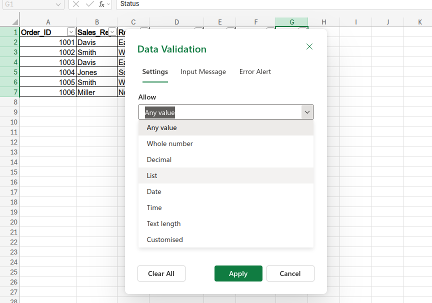
4. Secure Data Integrity with Validation
You must restrict the type of data that users can enter into your spreadsheets to prevent broken formulas downstream. Data Validation acts as a strict, automated gatekeeper for your reporting systems.
- Highlight cells G2:G7 (your "Status" column). Click the Data tab on the web ribbon and click Data Validation. Change the "Allow" setting to List, and in the "Source" box, simply type: Paid, Pending.
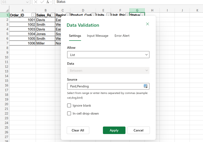
- Instead of letting colleagues manually type whatever they want (which leads to messy variations like "Done," "paid," or "Pending!"), Anyone clicking on cell G2 will now be forced to pick from a strict, clickable dropdown menu.
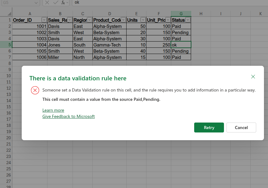
- This guarantees 100% clean data entry, preventing typos and unexpected text variations from ruining your PivotTable groupings or crashing complex statistical formulas later on.
Validating Your Findings with Visuals
A simple table of numbers rarely convinces stakeholders to take decisive action. Excel offers excellent visualization types that go far beyond standard, basic bar charts.
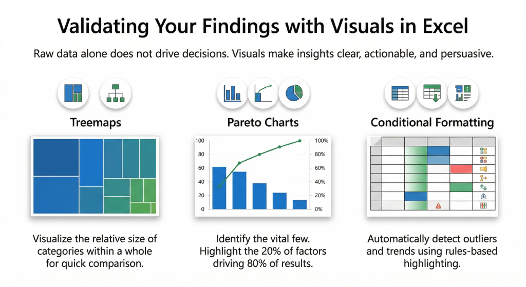
- Treemaps: These are highly effective for showing the relative size of different categories within a larger whole.
- Pareto Charts: Use these to instantly identify the "Vital Few," such as the 20% of products generating 80% of revenue.
- Conditional Formatting: Apply this to automatically highlight outliers or financial trends based on specific rules you set.
Memorizing formula syntax is only the first step toward building scalable reporting systems. You must be able to execute these commands accurately without relying on continuous troubleshooting. Taking a structured Excel quiz helps you identify specific knowledge gaps before you apply these techniques to live corporate data.
Conclusion
Securing a high-level role in the technology sector requires much more than basic spreadsheet familiarity. You must actively deploy Excel commands for data analysis to eliminate manual effort and maximize your strategic insight.
The progression starts with replacing outdated formulas with XLOOKUP and heavily automating your data preparation using PivotTables or Power Query. By treating your spreadsheets as dynamic, scalable systems, you actively protect your workflow from hidden errors. By diligently following this approach, you establish yourself as a highly capable, irreplaceable technical professional.