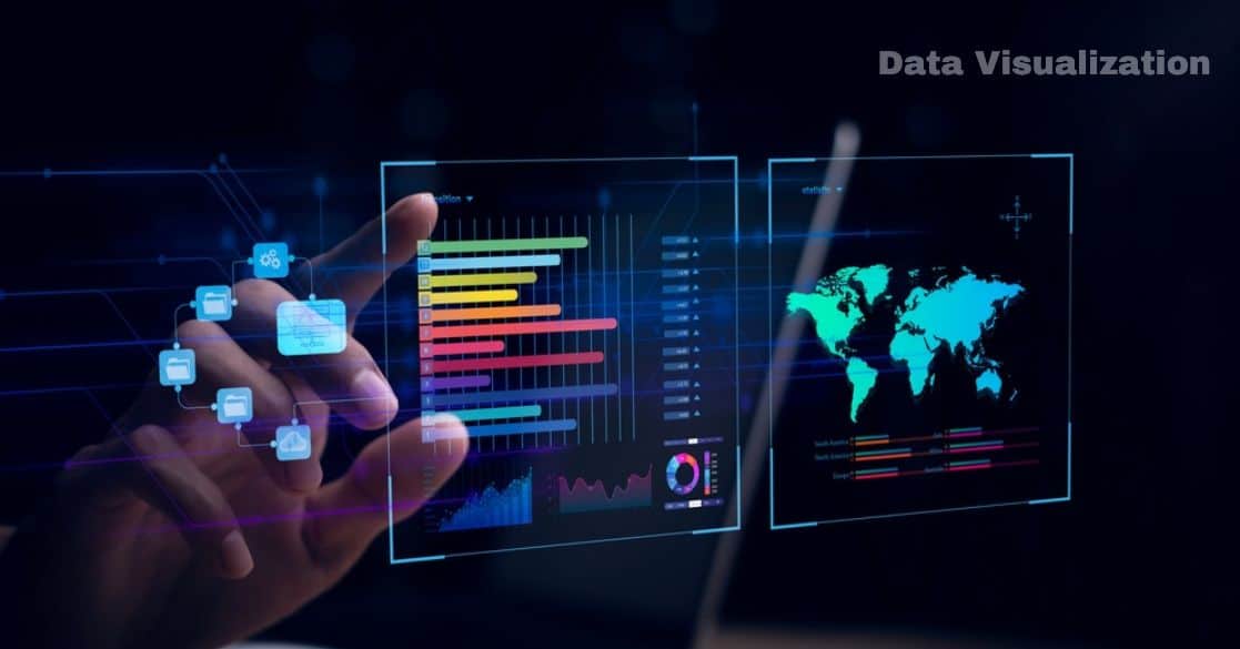
In today’s data-driven era, transforming raw numbers into compelling visuals is key to uncovering hidden insights. By leveraging tools like charts, graphs, heatmaps, and dashboards, data visualization helps simplify complex datasets and support smart, strategic decisions.
This article explores the core concepts, techniques, and tools that make data visualization a vital asset in various industries.
What is Data Visualization?
Data visualization is the graphical representation of information and data using visual elements such as charts, graphs, heatmaps, and dashboards.
It is an approach to turn structured and unstructured data into graphical formats that make analysis accessible through better interpretation. This approach involves:
- Data preprocessing: Data preparation through cleaning and then transforming procedures enables analysis.
- Graphical representation: Using charts, graphs, and interactive dashboards to depict relationships and trends.
- Insights extraction: Understanding the underlying patterns and making decisions based on visualized data.
Key Components of Data Visualization:
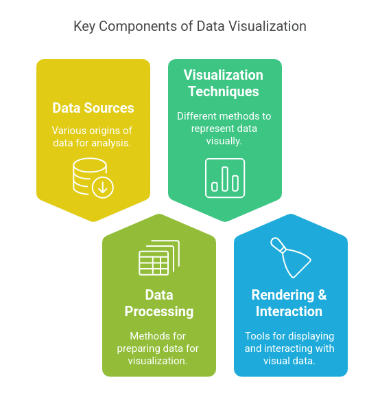
- Data Sources: Databases (SQL, NoSQL), APIs, spreadsheets, and real-time streaming data.
- Data Processing: ETL (Extract, Transform, Load) pipelines, data wrangling, and feature engineering.
- Visualization Techniques: Line charts, bar graphs, scatter plots, heat maps, and more.
- Rendering & Interaction: Using tools like D3.js, Tableau, Power BI, and Matplotlib.
Data Visualization using Power BI
Learn how to transform raw data into meaningful insights with Power BI. This course covers essential visualization techniques to help you create compelling, interactive dashboards and reports.
Why is Data Visualization Important?
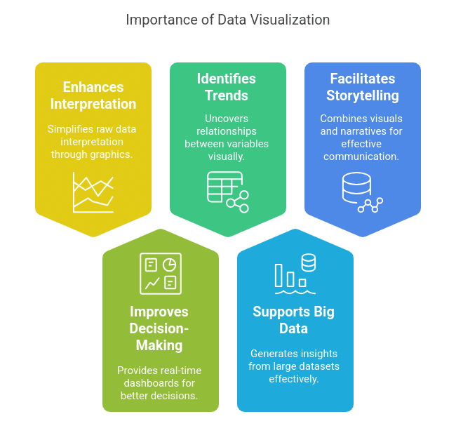
1. Enhances Data Interpretation:
Raw numerical data is challenging to interpret. Data visualization simplifies this by representing information graphically, making it easier to identify trends, patterns, and outliers.
2. Improves Decision-Making:
Business intelligence (BI) software employs data visualization capabilities that provide real-time dashboards to executives for faster and better decision-making.
3. Identifies Trends & Correlations:
Visualization techniques like scatter plots and correlation matrices help analysts uncover relationships between variables in machine learning (ML) and statistical analysis.
4. Supports Big Data Analytics:
Big data growth brings organizations face-to-face with huge datasets from multiple sources. Data visualization tools that operate with big data platforms, including Apache Hadoop, Spark, and Google BigQuery, generate understandable insights.
5. Facilitates Data Storytelling:
Data storytelling is a technique that combines visuals with narratives to communicate key findings effectively. This is essential in industries like finance, healthcare, and digital marketing.
Technical Aspects of Data Visualization
1. Types of Data Visualization Techniques
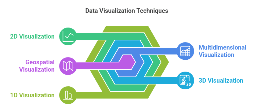
- 1D Visualization (Single-variable data): Histograms, bar charts, pie charts.
- 2D Visualization (Two-variable data): Scatter plots, line charts.
- 3D Visualization: Heatmaps, 3D scatter plots.
- Multidimensional Visualization: Parallel coordinates, radar charts, treemaps.
- Geospatial Visualization: Maps, geographic heatmaps (e.g., Google Maps data overlays).
2. Data Visualization Libraries & Tools
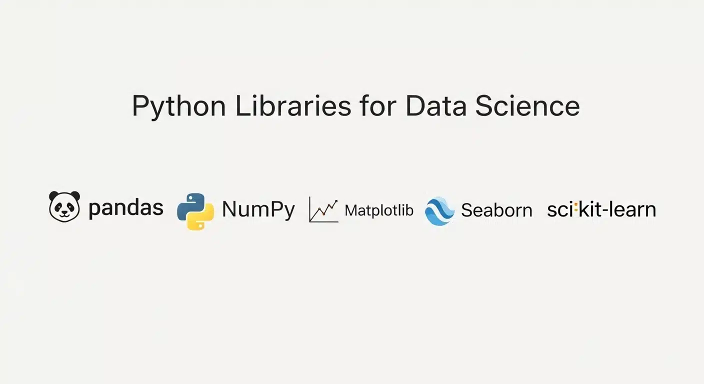
Python Libraries:
- Matplotlib: Basic plotting library for static graphs.
- Seaborn: Statistical data visualization (correlation heatmaps, violin plots, etc.).
- Plotly: Interactive visualizations for web applications.
- Dash: Python framework for building interactive dashboards.
JavaScript Libraries:
- D3.js: Robust library for interactive and dynamic data visualizations.
- Chart.js: Simple and flexible for creating responsive charts.
- Three.js: 3D visualization in the browser.
Business Intelligence (BI) Tools:
- Tableau: Drag-and-drop visualization with powerful analytics capabilities.
- Power BI: Microsoft’s enterprise-grade data visualization tool.
- Google Data Studio: Free tool for creating dashboards from Google Analytics, Ads, and more.
As you move beyond basic 1D and 2D charts, representing multidimensional, geospatial, and unstructured text data becomes much more complex. For professionals and graduate-level learners ready to tackle these challenges, the flexible, 20+ hour Advanced Techniques in Data Visualization online course by Johns Hopkins University is the ideal next step.
This program teaches you how to design interactive visualizations that support exploration, filtering, and insight discovery. You will get hands-on experience using Python, Jupyter Notebooks, Plotly, NetworkX, and Altair to visualize hierarchical networks, analyze large text corpora, and map geospatial data accurately while accounting for projection, scale, and distortion.
Read: Best Data Visualization and BI Tools
3. Real-Time Data Visualization
- Streaming Data Pipelines: Apache Kafka, Apache Flink, and Spark Streaming.
- Dashboard Integration: Using BI tools and web frameworks to visualize live data from IoT devices, financial markets, and social media analytics.
Challenges in Data Visualization
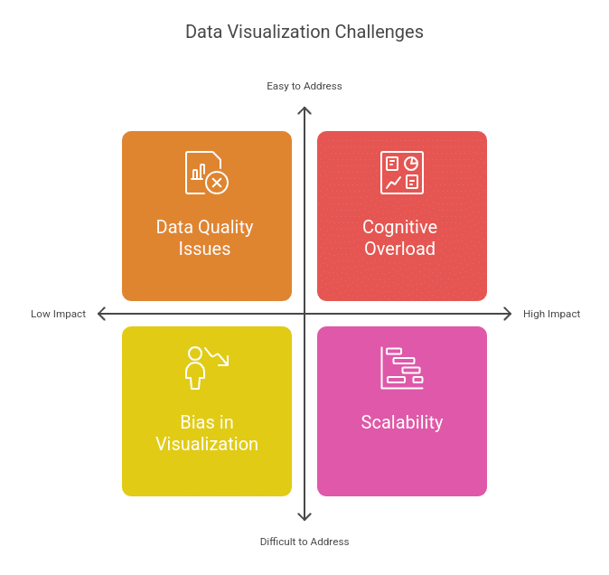
- Data Quality Issues: Inaccurate or incomplete data can lead to misleading visualizations.
- Scalability: Handling large-scale datasets requires optimized rendering techniques.
- Cognitive Overload: Overloading dashboards with too many visual elements reduces interpretability.
- Bias in Visualization: Poorly designed visualizations can misrepresent data and lead to incorrect conclusions.
Understanding how to spot flaws and bias is just as important as knowing how to build a chart. If you want to build strong fundamentals in ethical data representation, the self-paced, 20+ hour Foundations of Data Visualization course by Johns Hopkins University is a perfect fit.
Through analytical assessments like "Spot the Flaw: Misleading Data in the Wild" and "Debt by Design: Critiquing a Complex Dashboard," you will learn to evaluate visualization techniques, identify their limitations, and understand how choices like omitted axes or distorted scales erode trust. You will walk away with a firm grasp of human visual perception and the core design principles needed to create clear, accurate representations of data.
Future Trends in Data Visualization
- AI-Powered Visual Analytics: AI-driven insights generation and anomaly detection in visualizations.
- Augmented Reality (AR) & Virtual Reality (VR) Visualizations: Interactive 3D data representations.
- Automated Data Storytelling: NLP-driven data narratives for non-technical users.
- Edge Computing for Real-Time Visualization: On-device analytics for IoT and real-time monitoring.
Learn Data Visualization with Great Learning
Great Learning offers free data visualization courses covering fundamental to advanced concepts. These courses are designed for beginners and professionals looking to enhance their data analysis skills.
Post Graduate Programs
For those looking for in-depth training and industry-recognized certification, Great Learning provides postgraduate (PG) programs in data science and analytics, including comprehensive data visualization modules.
- PG Program in Data Science – Covers visualization, machine learning, and big data analytics.
- PG Program in Data Science and Analytics – Focuses on BI tools like Tableau and Power BI for decision-making.
Explore these courses and enhance your expertise in data visualization today!
Conclusion
Data visualization is a part of data analysis that is incredibly important to help businesses and scientists get the correct information out of large and complicated datasets. Organizations are using advanced visualization techniques, modern tools, and interactive dashboards to make data-driven decisions with precision and clarity.
Frequently Asked Questions
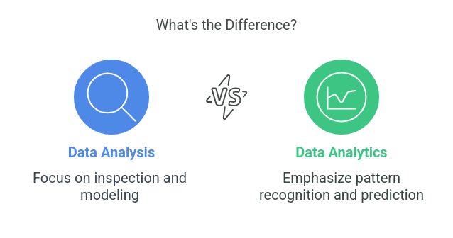
1. How does data visualization differ from data analytics?
Data visualization focuses on presenting data in a graphical format to enhance understanding, while data analytics involves extracting insights, patterns, and predictions using statistical methods and algorithms.
2. Which procedures result in producing successful data visualization products?
Data visualization follows best practices by selecting suitable chart types, simple designs that use non-deceptive displays, and standard color patterns that create universal accessibility.
3. How does data visualization integrate with machine learning models?
Data visualization helps in feature selection, model performance evaluation, and identifying trends in machine learning models by displaying confusion matrices, ROC curves, and decision boundaries.
4. What are interactive data visualizations, and how are they used?
Users can influence and study data in real time using filtering functions, drill-down tools, and hover-based effects that are typical features of Tableau and Power BI dashboards.
5. Can data visualization be used for real-time monitoring?
Yes, real-time data visualization is widely used in stock markets, IoT applications, and cybersecurity, where live data streams are processed and displayed instantly for immediate decision-making.