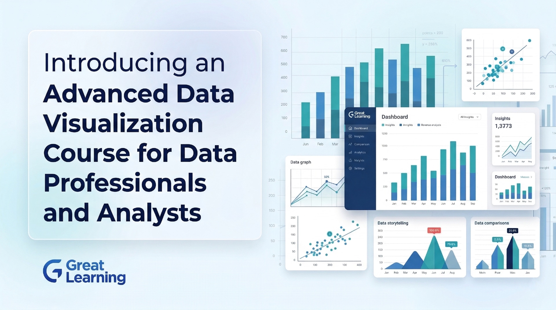
As organizations continue to generate massive amounts of information, the ability to transform complex data into clear, accurate, and impactful visual narratives has become an essential skill. Professionals need to move beyond standard tables and charts to create meaningful visual stories that drive actionable insights.
Recognizing this need, the Johns Hopkins University (JHU) Whiting School of Engineering has introduced the Foundations of Data Visualization course. It is an online, flexible, and self-paced program designed to equip learners with the core concepts and techniques of visual communication.
The program is delivered by world-renowned Johns Hopkins University faculty and made accessible through Great Learning, providing professionals with real-world case studies, analytical assessments, and practical frameworks to enhance their data visualization skills.
About the Johns Hopkins Data Visualization Program
The Foundations of Data Visualization is a 20+ hour online, flexible course. The curriculum focuses on the core concepts and techniques that enable clear, ethical, and meaningful visual communication.
This course equips learners to apply best practices in visual encoding and design through a comprehensive mix of recorded video lectures, assigned readings, real-world case studies, and analytical assessments. Furthermore, it offers the opportunity to use Python and Jupyter Notebooks to develop tools and gain familiarity with existing visualization libraries.
What Makes This Program Unique?
Johns Hopkins University (JHU) is a prestigious institution consistently ranked among the top 10 universities in the U.S. and maintains a strong reputation in research and education. The course reflects this academic rigor while focusing on practical visual analytics and human-computer interaction.
1. Prestigious Academic Standing
JHU consistently ranks among the leading institutions globally, including:
- Ranked 6th National University (U.S. News & World Report 2025).
- Ranked 1st Computer Information Technology (U.S. News & World Report 2025).
- Ranked 13th Best Global University (U.S. News & World Report 2026).
2. Delivered by World-Class Faculty
- The course is taught by distinguished faculty, including Dr. Jesus Caban, Chief Data Scientist in the Program Executive Office, Defense Healthcare Management Systems.
- Learners benefit from faculty who blend academic rigor with industry experience, leading Artificial Intelligence practices at Fortune 500 companies.
3. World-Class Faculty Expertise
The courses are taught by faculty who are distinguished in academia and have industry experience leading Artificial Intelligence practices at Fortune 500 companies. This includes experts like Dr. Jesus Caban, Chief Data Scientist in the Program Executive Office, Defense Healthcare Management Systems.
4. Research-Driven Curriculum
The curriculum is designed based on the latest research and developments in Data Visualization, ensuring that students learn the most up-to-date and relevant information. It is backed by an institution that has maintained a top position in R&D for decades
Who Should Enroll?
The Foundations of Data Visualization program is designed for individuals seeking to build strong foundations in presenting and interpreting data. The program is particularly suitable for:
- Early to Mid-Career Data Professionals: Individuals seeking to move beyond tables and charts to create clear, meaningful visual stories.
- Analysts and Researchers: Professionals who regularly work with complex datasets and need to communicate their findings clearly and persuasively to various stakeholders.
- Designers and Communicators: Individuals interested in applying graphic design principles and human perception to create impactful, user-friendly Data Visualizations.
- Students and Academics: Those who wish to build a strong foundational understanding of Data Visualization techniques and their theoretical underpinnings.
What You Will Learn?
The curriculum is structured into four core modules, guiding learners from historical context to advanced design principles.
Module 1: Introduction to Data Visualization
Learners explore the foundations and historical evolution of visualization techniques. Key topics include:
- Identifying Misleading Visualizations.
- Role of Visualization in Simplifying Complex Data.
Module 2: Visualization Techniques
Learners explore techniques based on data type and evaluate basic charts and graphs. Key topics include:
- Strengths and Weaknesses of Hierarchical Visualizations and Scatter Plots.
- Choosing the Right Visualization for Tabular, Geospatial, and Scalar Data.
Module 3: Human Visual Perception
Learners uncover how perceptual principles inform effective information visualization. Key topics include:
- Influence of Visual Variables (Position, Color, Size).
- Applying Gestalt Principles and Grouping Techniques.
Module 4: Design Principles
Learners dive into the stages of the visual design process. Key topics include:
- Key Principles of Effective Design (Simplicity, Consistency, Organization).
- Understanding Graphical Excellence and Its Real-World Applications.
Analytical Assessments (Sample Projects)
To reinforce learning, participants complete hands-on analytical assessments. Examples include:
1. Spot the Flaw: Misleading Data in the Wild
Analyze deceptive charts to understand how visual choices like omitted axes or distorted scales can mislead audiences and erode trust.
2. Chart Smart: Building the Basics with the Iris Dataset
Create classic visualizations and practice the fundamentals of chart construction, labeling, and layout using the famous 1936 Iris flower dataset.
3. Visual Vocabulary: Designing with Encodings
Explore the power of position, color, size, and shape by creating custom visualizations with the "Tips" dataset to express patterns and comparisons more effectively.
4. Debt by Design: Critiquing a Complex Dashboard
Evaluate the U.S. Debt Clock dashboard through the lens of simplicity, structure, and graphical excellence to understand how overwhelming design choices can obscure meaning.
Key Learning Outcomes
By completing the program, learners will gain the ability to:
- Describe the foundations of human visual perception and explain how perceptual principles inform effective information visualization.
- Explain core visual design principles for creating clear and accurate representations of data.
- Analyze and evaluate visualization techniques, identifying their strengths, limitations, and potential for misleading representations.
- Differentiate among major data types, including tabular, hierarchical, geospatial, textual, and scalar, and explain appropriate visualization approaches for each.
- Identify established data visualization tools and environments within the broader field of information visualization.
Certification and Learning Ecosystem
Upon successful completion of the course, learners will earn a globally recognized Certificate of Completion and 2 Continuing Education Units (CEUs) from Johns Hopkins University.
The program is offered in collaboration with Great Learning, a leading global ed-tech company that has impacted 14 million+ learners from over 170 countries. Great Learning manages enrollments, payments, invoicing, and technology support for the course.
Next Step
Interested candidates can initiate the enrollment process by submitting their details through the official application page. After completing the registration and paying the applicable course fee, learners will receive a confirmation email with access instructions to the learning platform.
Once enrolled, participants can immediately begin the self-paced program, explore course materials, and engage with hands-on assessments.