
CSS stands for Cascading Style Sheet, developed and is maintained by the World Wide Web Consortium (W3C). It was first released on December 17, 1996, to separate the content from the presentation.
This article will walk you through the top 20 CSS interview questions. The questions range from intermediate to advanced questions.
How would you style an image or element to have rounded corners?
To style an image or element, we can use the border-radius property. It defines the radius of an image or element’s corners. The border-radius property have values of border-top-left-radius, border-top-right-radius, border-bottom-right-radius and
border-bottom-left-radius properties.
The border radius can have one to four values as defined below:
- One Value: This value applies to all four corners that are rounded equally.
- Two Value: In this, the first values apply to an element’s top-left and bottom-right corners, and the second value applies to the top-right and bottom-left corners of an element.
- Three Value: Here, the first value applies to the top-left corner, the second value applies to the top-right and bottom-left corners, and the third value applies to the bottom-right corner of an element.
- Four Value: In this, the first value applies to the top-left corner, the second value applies to the top-right corner, the third value applies to the bottom-right corner, at last, the fourth value applies to the bottom-left corner of an element.
Example of border-radius property:
<!DOCTYPE html>
<html>
<head>
<style>

#onevalue {
  border-radius: 15px;
  background: yellow;
  padding: 15px;
  width: 150px;
  height: 100px;
}

#twovalue{
  border-radius: 15px 50px;
  background: yellow;
  padding: 15px;
  width: 150px;
  height: 100px;

}

#threevalue {
  border-radius: 15px 50px 30px;
  background: yellow;
  padding: 15px;
  width: 150px;
  height: 100px;

}

#fourvalue {
  border-radius: 15px 50px 30px 5px;
  background: yellow;
  padding: 15px;
  width: 150px;
  height: 100px;

}
</style>
</head>
<body>

<h3>Example of border-radius Property</h3>

<p><b>One values - border-radius: 15px</b>:</p>
<p id="onevalue"></p>

<p><b>Two values - border-radius: 15px 50px: </b></p>
<p id="twovalue"></p>

<p><b>Three values - border-radius: 15px 50px 30px: </b></p>
<p id="threevalue"></p>

<p><b>Four value - border-radius: 15px 50px 30px 5px:</b></p>
<p id="fourvalue"></p>

</body>
</html>
Output

What are contextual selectors?
Contextual selectors in CSS provide different styles for different parts of our HTML page. We can assign contextual selectors directly to specific HTML tags, and also we can create independent classes and assign them to tags in the HTML.
What is the use of box-shadow in CSS?
The box-shadow property adds shadows to different element’s frames. We can give one or more shadows to an element. For adding more than one shadow to an element, we can separate it by commas.
Example
<!DOCTYPE html>
<html>
<head>
<style>

#example {
  border: 2px solid;
  padding: 15px;
  box-shadow: 5px 10px;
}
</style>
</head>

<body>

<h3>Example of box-shadow Property</h3>
<p>The box-shadow property defines the shadow of an element:</p>

<h3>box-shadow: 5px 10px:</h3>
<div id="example">
  <p><b>A div element with a shadow. The shadow color will be inherited from the text color.</b></p>
</div>
</body>
</html>
Output:

What are the various font-related attributes in CSS?
- Here are some font-related attributes:
- Font-family: It is used to change the face of a font.
- Font-style: It is used to make a font oblique or italic.
- Font-variant: It is used to change the targeted test into small caps.
- Font-weight: It is used to increase or decrease how bold or light a font would appear.
- Font-size: It is used to increase or decrease the size of a font.
Example for font-related attributes
<html>
<head>
<style>
p.a {
  font: 20px Arial, sans-serif;
}
p.b {
 font: italic bold 12px/30px Georgia, serif;
}
</style>
</head>

<body>
<h2>The Font Property</h2>
<p class="a">This is a paragraph, the font size of this paragraph is set to 15 pixels, and the font family is Calibri. </p>

<p class="b">In this paragraph, the font is set to italic and bold, the font size is set to 12 pixels, the line height is set to 30 pixels, and the font family is Georgia. </p>
</body>
</html>
Output:

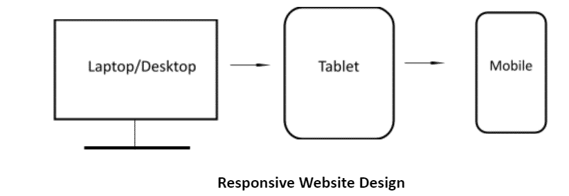
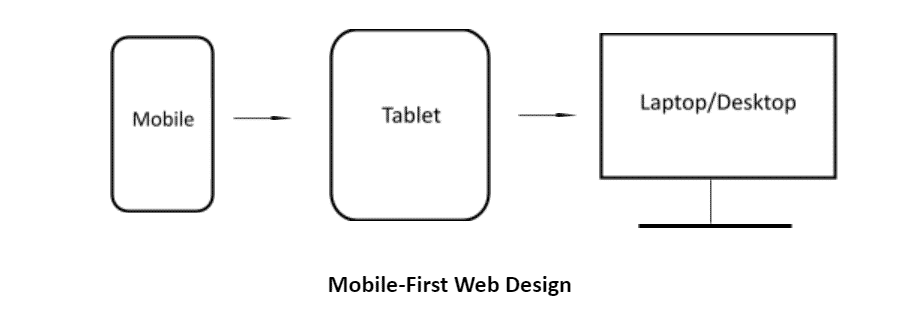
Explain the difference in approach when designing a responsive website over a mobile-first strategy?
The responsive website design starts on the desktop, keeping the assumption that visitors will browse the website from his or her computer. After that, the website undergoes modification so that it can be browsed on smartphones or tablets. Thus, we can say that website is scaled down, commonly known as desktop-first or graceful degradation.
A mobile-first strategy is an approach where the designers design a website for the smallest mobile device and then scale upwards to be browsed on desktop computers. This strategy is also known as progressive enhancement.
What are the different ways to position a particular element in CSS?
There are five different ways to position a particular element in CSS
- Static: In HTML, the elements are static by default; they are positioned according to the normal flow of the page.
- Relative: Here, the HTML element is positioned relative to its normal position. This allows the object to be placed in relation to one another.
- Fixed: When we fixed any HTML element its remains in its specified location even as the content scrolls underneath it. So a fixed element doesn’t leave any gaps on the page.
- Absolute: It defines the positioned relative to the nearest positioned ancestor. Here the “positioned” element is those whose position is anything except static.
- Sticky: A sticky position is based on the user scroll’s position. It toggles between relative and fixed, depending on the scroll position.
Example
<html>
<head>
<style>

div.static {
  position: static;
}

div.relative {
  position: relative;
  left: 20px;
}

div.fixed {
  position: fixed;
  bottom: 500px;
  right: 600px;
}
div.absolute {
  position: absolute;
  top: 270px;
  right: 800;
}

div.sticky {
  position: -webkit-sticky;
  position: sticky;
  top: 0;
}

</style>
</head>

<body>

<h3>Example of element positioning in CSS</h3>

<h4> Static Positioning </h4>
<div class="static">
  This div element has position: static;
</div>

<h4> Relative Positioning </h4>
<div class="relative">
  This div element has position: relative;
</div>

<h4> Fixed Positioning </h4>
<div class="fixed">
  This div element has position: fixed;
</div>

<h4> Absolute Positioning </h4>
<div class="absolute">
  This div element has position: absolute;
</div>

<h4> Sticky Positioning </h4>
<div class="sticky">This div element has position: sticky!
</div>

</body>
</html>
Output:

Also Read: Introduction to HTML
What effect would this piece of CSS code have? {box-sizing: border-box;}
The box-sizing: border-box property on an element changes how the width and height of an element are calculated; it also includes the border and padding calculations.
The height of an element is calculated using the content’s height + vertical padding + vertical border width.
Now the width of an element is calculated using the content’s width + horizontal padding + horizontal border width.
What are functions/mixins?
A function is a group of statements that perform a task and return a single value of any Sass data type. A mixins is quite similar to the function. Mixins directive lets you create CSS that can be reused throughout the website.
Sass mixin syntax:
@mixin name {
	property: value;
	property: value;
	…
}
Give an example of how you would use counter-increment and counter-reset in CSS to create automatic numbering within a webpage?
In the counter-reset property, the CSS counters resets to a given value. After that, the counter-increment property increases or decreases the value of one or more CSS counters. Here is an example related to counter-increment and counter-reset that can show automatic numbering within a webpage.
Example:
body {
   counter-reset: section;
}

h1 {
   counter-reset: subsection;
}

h1::before {
   counter-increment: section;
   content: “Section ” counter (section) “: “;
}

h2::before {
   counter-increment: subsection;
   content: counter(section) “.” counter(subsection) “ “;
}
What are Vendor-Prefixes?
Vendor prefixes are a way to use nonstandard CSS properties or Javascript APIs to experiment with new ideas without waiting for each of them to become available for every browser. Vendor Prefixes are not a hack, and we should use them freely. They are only temporary.
Examples of Vendor-Prefix
Major browsers use the following prefixes:
-WebKit- Safari, Chrome, newer versions of Opera, and almost all iOS browsers.
-Moz- Firefox.
-o- Old versions of Opera.
-ms- Microsoft Edge and Internet Explorer.
What is a CSS pre-processor? When do you recommend a pre-processor to be used in a project?
CSS pre-processor is used to compile the code, which is written via a special compiler. The CSS pre-processor gives added benefits that do not present in pure CSS, such as nesting selector, mixin, conditionals, and so on. The popular CSS pre-processor Sass, Stylus, and LESS. Learn Sass, Stylus, and LESS to enhance your skills.
During the development phase of bigger projects, the developer faces many issues related to debugging, formatting and maintenance which increase the time and budget of the project. In such cases, a developer can use a pre-processor; its syntax makes the code writing easy and cleaner for the developers.
Also Read: Top UI Developer Interview Questions with Answers
What is Block Formatting Context? How does it work?
A block formatting context (BFC) is a part of a visual CSS rendering of a web page. It is the region in which the layout of block boxes is laid out.
A block formatting context (BFC) is an HTML box that satisfies at least one of the following conditions:
- The root element of the document
- The value of float is not none
- The value of position is neither static nor relative
- The value of display is table-cell, table-caption, inline-block, flex, or inline-flex
- The value of overflow is not visible.
What is file splitting? When is it used?
Working on larger stylesheets and big projects creates a challenge for maintaining a huge CSS file. While working on these projects, it is good to use a modular approach and split your CSS across multiple files. Splitting CSS files makes it easy to parcel among the team members to work on different tasks. This will also help to increase the overall productivity.
Here are some dummy CSS file structures:
- forms.css
- table.css
- layouts.css
- reset.css
- lists.css
- typography.css
- carousel.css
Explain the scenario you would use translate() instead of absolute positioning?
When we use translate(), it has a shorter paint time on elements with CSS animation or transitions because it uses the hardware accelerations wherever possible. Also, setting up the percentage values with translate, the percentage is calculated as a percentage of the elements computed width or height. Hence translate() is more efficient as compared to absolute positioning while using animation or transitions.
How does a browser determine what elements match a CSS selector?
The browser reads the CSS selectors from rightmost to the left. According to the key selector, browser filters out elements in the DOM (Document Object Model) and then traverses up its parent elements to determine matches.
If the length of the selector chain will be shorter, specific then the browser can determine faster whether the element matched with the selector or not.
What’s the difference between a relative, fixed, absolute, and statically positioned element?
- Relative positioning defines the positioning so that elements are offset from the last element in the HTML page. This allows objects to be placed in relation with one another.
- Fixed positioning defines the positioned relative to the viewport and remains in its specified location even as the content scrolls underneath it. Thus, a fixed element doesn’t leave any gaps on the page. Fixed positioning does not work in Internet Explorer 6 or earlier.
- Absolute positioning defines the positioned relative to the nearest positioned ancestor. This will adjust according to the parent position; if there is no parent element, then it uses the document body as its parent.
- Static positioning is the default. It defines the positioned element are not affected– it flows in the normal rendering sequence of the web page.
What is CSS flexbox?
CSS Flexbox is officially known as CSS Flexible Box Layout; it is a CSS3 web layout model. The main function is to provide an efficient way to layout, distribute, and align spaces among the container items on different screen sizes. The CSS flexbox allows responsive elements within a container to be automatically arranged depending upon the type of device or screen. It is recommended chiefly over the block model.
In CSS3 flexbox contains Flex Container and Flex Item:
Flex Container: It is the parent element that holds all the flex items
Flex Item: It is the child element held within the flex item. There can be more than one flex item in a container.
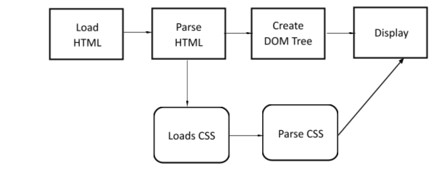
How does CSS work under the hood?
Whenever a browser displays a page, it combines the document’s content with its style information. Then, itthe processes the document in different stages.
- The browser loads the HTML page, which is converted into DOM (Document Object Model). The DOM represents XML or HTML document in a tree structure, wherein each node represents objects.
- The browser fetches most of the resources that are linked to the HTML document, such as images, videos, etc. and a linked CSS page.
- The browser parses the fetched CSS page and sorts them by their selector type into different buckets.
- Then the tree is created as per the order it should appear after the rules had been applied to it.
- The visual display of the page is then shown on our screen.
Here is the diagram that can help you to understand the working of CSS under the hood.
Recommend a way to optimize a certain webpage for prints.
To create a printer-friendly website, it is recommended to identify and control the “Content Area” of your website. Here are some points that can help to optimize a webpage for prints.
- Create a stylesheet for print
- Adjust your paragraph tag property
- Format your links
- Avoid using unnecessary HTML Tables
- Adjust any custom class
- Use page breaks
- Size your page for print – max height etc.
Conclusion
Hope this CSS interview question and answer list will help you to crack the interview.