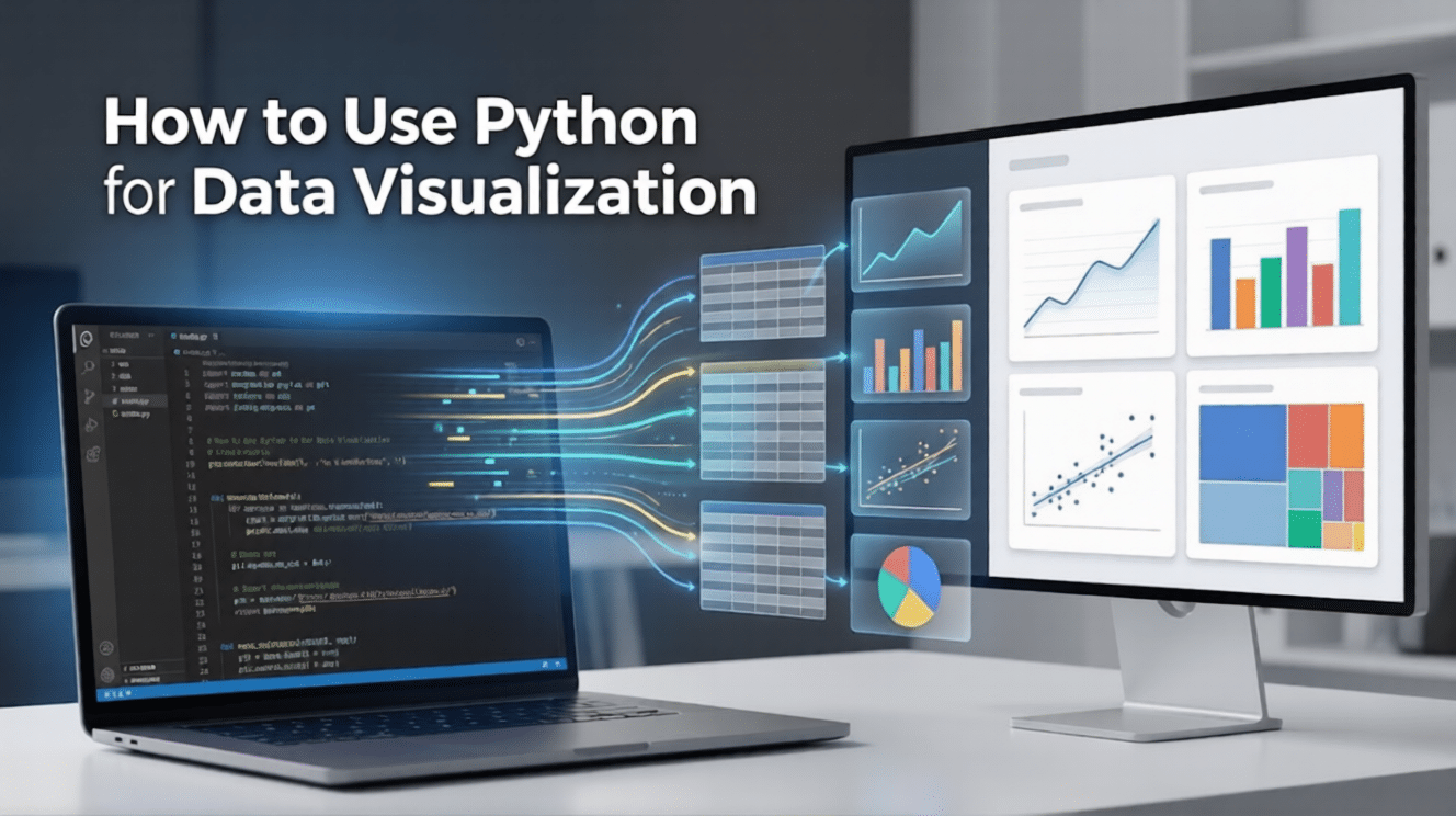
Data on its own can be overwhelming, but when presented visually, it becomes powerful, persuasive, and easy to understand. Python has emerged as a go-to language for data visualization because of its simplicity, flexibility, and rich ecosystem of libraries.
From simple bar charts to advanced interactive dashboards, Python enables professionals to turn complex datasets into clear visual insights.
In this blog, we’ll walk through how to use Python for data visualization, covering the essential libraries, basic setup, and practical examples to help you create compelling visualizations.
Why Choose Python?
- Ease of Learning: Python’s syntax is clean and mirrors human language, making it accessible for non-developers.
- Vibrant Community: As of 2026, Python remains the top language for data science, meaning you can find a solution or a tutorial for almost any problem online.
- Integration: It works seamlessly with data manipulation tools like Pandas and Polars, allowing you to clean and visualize data in a single workflow.
Essential Libraries for 2026
To understand how to visualise data in Python, you must first familiarise yourself with the core libraries that power the ecosystem. Every tool possesses a certain strength, and selecting the tool is half the battle.
1. Matplotlib: The Foundation
Matplotlib is the oldest and most widely used library. It provides total control over every element of a plot. It remains the standard for publication-quality, static 2D graphics.
2. Seaborn: Statistical Elegance
Built on top of Matplotlib, Seaborn simplifies the process of creating professional-looking statistical charts. It comes with built-in themes and color palettes that make your data clear without requiring hundreds of lines of code.
3. Plotly: Interactivity and the Web
If you want users to zoom, hover, and click on data points, Plotly is the answer. It is a powerful tool for creating interactive, web-ready visualizations often used in executive dashboards.
4. Polars and Big Data Tools
As datasets grow into the gigabyte range, traditional tools can slow down. In 2026, Polars has emerged as a high-performance alternative to Pandas, allowing for lightning-fast data processing before you even start the visualization using Python.
While these libraries are powerful, they require a solid grasp of Python logic to use effectively. If you want to build a strong foundation, consider the Master Python Programming course by Great Learning. This premium program covers essential coding concepts that will help you understand the basics, data structures, functions, and much more, ultimately helping you to develop professional-grade visualizations with confidence.
In this course, you will learn the fundamentals of Python: from basic syntax to mastering data structures, loops, and functions. You will also explore OOP concepts and objects to build robust programs.
Step-by-Step Guide: How to Use Python for Data Visualization
Follow these steps to build your first professional chart.
Step 1: Set Up Your Environment
Most professionals use Jupyter Notebooks or VS Code. These environments allow you to write code in "cells" and see the resulting visual immediately.
Step 2: Import Your Libraries and Data
Start by importing the necessary packages. Instead of loading a dataset, we will create a clear, relatable “Store Sales” dataset right in the code. You can import your data from CSV, Excel files, databases, or APIs in real-world projects, but creating it manually here helps you clearly understand the structure and relationships within the data before visualizing it.
Import pandas as pd

import matplotlib.pyplot as plt

import seaborn as sns

# Create sample data manually so the structure is visible

data = {

'Day': ['Mon', 'Tue', 'Wed', 'Thu', 'Fri', 'Sat', 'Sun'] * 2, 'Sales': [120, 150, 170, 210, 290, 350, 400, 130, 160, 180, 220, 310, 360, 420], 'Customers': [20, 25, 30, 35, 50, 80, 95, 22, 28, 32, 38, 55, 85, 100], 'Category': ['Food'] * 7 + ['Drinks'] * 7

}

# Convert dictionary to a DataFrame

df = pd.DataFrame(data)

# Display the first few rows to verify

print(df.head())
Step 3: Choose the Right Chart Type
Selecting the wrong chart can lead to misinterpretation. Use this table as a quick reference:
| Data Goal | Recommended Chart | Example using our Data |
| Show trends over time | Line Chart | Sales per Day |
| Compare categories | Bar Chart | Total Sales: Food vs. Drinks |
| Show parts of a whole | Treemap/Pie | % of Sales from Food |
| Explore relationships | Scatter Plot | Sales vs. Customer Count |
| Show distribution | Histogram | Distribution of Sales amounts |
Step 4: Generate the Plot
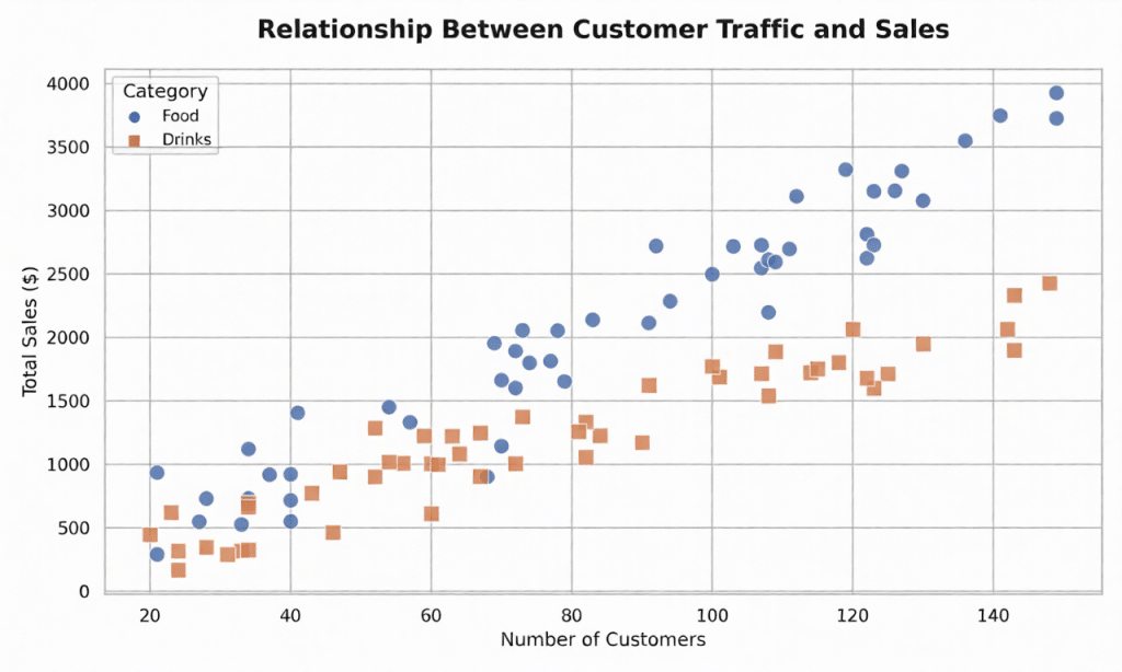
Now that our df (DataFrame) is ready, we can generate a plot. Since we have Numerical data (Sales) and Categorical data (Food/Drinks), a scatter plot with a hue is perfect to see if more customers actually lead to higher sales across different categories.
# Set a clean visual theme

sns.set_theme(style="whitegrid")

# Initialize the figure size

plt.figure(figsize=(10, 6))

# Create the plot using the new 'df' columns

sns.scatterplot(

    data=df,

    x='Customers',

    y='Sales',

    hue='Category',

    style='Category',

    s=100  # Size of the dots

)

# Add clear labels

plt.title('Relationship Between Customer Traffic and Sales', fontsize=15)

plt.xlabel('Number of Customers')

plt.ylabel('Total Sales ($)')

# Show the plot

plt.show()
Output
By mastering this workflow, you demonstrate how to use Python for data visualization in a way that is both reproducible and scalable.
Advanced Techniques and Interactivity
Once you have mastered the basics, you can move into "Data Storytelling," the art of guiding a viewer through a narrative.
Interactive Dashboards with Streamlit
Tools like Streamlit allow you to turn a Python script into a live web application in minutes. This is ideal in internal company tools, in which the stakeholders would be required to filter out information in real-time and without accessing the code.
AI-Assisted Visualization
In 2026, tools such as Microsoft’s Data-Formulator use AI agents to help you explore data through rich visuals. You can describe the chart you want in plain English, and the AI helps generate the necessary Python code to render it.
For professionals, engineers, and graduate-level learners ready to expand beyond foundational methods, the Advanced Techniques in Data Visualization course by Johns Hopkins University offers the perfect next step.
This flexible, 20+ hour online program teaches you how to design interactive visualizations that support exploration, filtering, and insight discovery. You will gain hands-on experience using Python, Jupyter Notebooks, Plotly, NetworkX, and Altair to visualize hierarchical networks, accurately map geospatial data (accounting for projection and scale), and analyze unstructured text data to uncover deep patterns.
Best Practices for Impactful Visuals
Effective visualization using Python is about communication. To ensure your audience understands your message:
- Keep it Simple: Avoid "chart junk" like unnecessary 3D effects. If an element doesn't add information, remove it.
- Label Everything: Every chart needs a clear title and labeled axes with units.
- Use Color Strategically: Use color to highlight important data points, not just for decoration. Ensure your palettes are accessible to those with color vision deficiencies.
- Integrity Matters: Always start your y-axis at zero for bar charts to avoid exaggerating differences.
While learning Python libraries is crucial, knowing how to visually encode data ethically and effectively is what makes a visualization powerful, and to help you build such expertise, the Foundations of Data Visualization course by Johns Hopkins University is the best place to start.
Designed for professionals seeking deeper data insights, this course teaches you how to translate complex data into clear and meaningful visual communication. Through real-world use cases, like building charts with the 1936 Iris dataset and critiquing complex dashboards, you will master human visual perception, understand core design principles, and learn to identify misleading representations to transform data into actionable insights.
Conclusion
Learning to use Python for data visualization is a significant advantage in today's job market. By moving beyond static spreadsheets and embracing the dynamic world of Python libraries, you can uncover insights that drive innovation.
Whether you use the foundational control of Matplotlib or the interactive capabilities of Plotly, the Python ecosystem provides everything you need to succeed in 2026.
While understanding these individual concepts is a great milestone, the real challenge for any beginner is learning how to connect the dots. If you’ve ever felt overwhelmed by complex syntax or 'code-speak,' remember that every expert started with the same simple building blocks. To help you bridge the gap between reading about code and actually writing it, we recommend starting your journey with our Free Python Course. This course is built specifically for absolute beginners to provide a clear, hands-on roadmap. It focuses on the 'why' behind the code, helping you move from zero experience to building your own functional scripts at your own pace.
Python Fundamentals for Beginners Free Course
Master Python basics, from variables to data structures and control flow. Solve real-time problems and build practical skills using Jupyter Notebook.


