- What is the AUC - ROC Curve?
- Defining terms used in AUC and ROC Curve
- How to speculate on the performance of the model?
- The relation between Sensitivity, Specificity, FPR, and Threshold
- Threshold Selection
- Performance Assessment
- Classifier Comparison
What is the AUC - ROC Curve?
AUC - ROC curve is a performance measurement for the classification problems at various threshold settings. ROC is a probability curve, and AUC represents the degree or measure of separability. It tells how much model is capable of distinguishing between classes. Higher the AUC, better the model is at predicting 0s as 0s and 1s as 1s. By analogy, Higher the AUC, better the model is at distinguishing between patients with the disease and no disease.
The ROC curve is plotted with TPR against the FPR where TPR is on the y-axis and FPR is on the x-axis.
Defining terms used in AUC and ROC Curve
Consider a two-class prediction problem, in which the outcomes are labeled either as positive (p) or negative (n). There are four possible outcomes from a binary classifier. If the outcome from a prediction is p and the actual value is also p, then it is called a true positive (TP); however, if the actual value is n then it is said to be a false positive (FP). Conversely, a true negative (TN) has occurred when both the prediction outcome and the actual value are n, and false-negative (FN) is when the prediction outcome is n while the actual value is p.
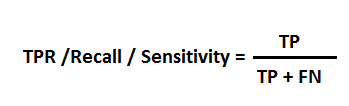
TPR(True Positive Rate) / Recall / Sensitivity
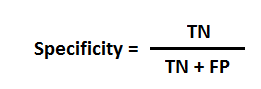
Specificity
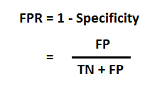
FPR
Also Read: Data Structures using Java
How to speculate on the performance of the model?
An excellent model has AUC near the 1, which means it has a good measure of separability. A poor model has AUC near the 0, which means it has the worst measure of separability. It means it is reciprocating the result. It is predicting 0s as 1s and 1s as 0s. And when AUC is 0.5, it means the model has no class separation capacity whatsoever.
Most classifiers produce a score, which is then thresholded to decide the classification. If a classifier produces a score between 0.0 (definitely negative) and 1.0 (definitely positive), it is common to consider anything over 0.5 as positive.
However, any threshold applied to a dataset (in which PP is the positive population and NP is the negative population) is going to produce true positives (TP), false positives (FP), true negatives (TN) and false negatives (FN). We need a method which will take into account all of these numbers.
The relation between Sensitivity, Specificity, FPR, and Threshold
Accuracy = (1 – Error) = (TP + TN)/(PP + NP) = Pr(C), the probability of a correct classification.
Sensitivity = TP/(TP + FN) = TP/PP = the ability of the test to detect disease in a population of diseased individuals.
Specificity = TN/(TN + FP) = TN / NP = the ability of the test to correctly rule out the disease in a disease-free population.
Threshold Selection
It is immediately apparent that a ROC curve can be used to select a threshold for a classifier that maximizes the true positives while minimizing the false positives.
However, different types of problems have different optimal classifier thresholds. For a cancer screening test, for example, we may be prepared to put up with a relatively high false-positive rate in order to get a high true positive, it is most important to identify possible cancer sufferers.
For a follow-up test after treatment, however, a different threshold might be more desirable, since we want to minimize false negatives, we don’t want to tell a patient they’re clear if this is not the case.
Also Read: Logistic Regression in Python and R
Performance Assessment
ROC curves also give us the ability to assess the performance of the classifier over its entire operating range. The most widely-used measure is the area under the curve (AUC). As you can see from Figure 2, the AUC for a classifier with no power, essentially random guessing, is 0.5, because the curve follows the diagonal. The AUC for that mythical being, the perfect classifier, is 1.0. Most classifiers have AUCs that fall somewhere between these two values.
An AUC of less than 0.5 might indicate that something interesting is happening. A very low AUC might indicate that the problem has been set up wrongly, the classifier is finding a relationship in the data, which is, essentially, the opposite of that expected.
Classifier Comparison
The AUC can be used to compare the performance of two or more classifiers. A single threshold can be selected, and the classifiers’ performance at that point compared, or the overall performance can be compared by considering the AUC.
Most published reports compare AUCs in absolute terms: “Classifier 1 has an AUC of 0.85, and classifier 2 has an AUC of 0.79, so classifier 1 is better“. It is, however, possible to calculate whether differences in AUC are statistically significant.
Hope you enjoyed this tutorial on ROC Curve! If you wish to learn more such concepts, you can check out our free courses on Great Learning Academy.
Our Machine Learning Courses
Explore our Machine Learning and AI courses, designed for comprehensive learning and skill development.
| Program Name | Duration |
|---|---|
| MIT No code AI and Machine Learning Course | 12 Weeks |
| MIT Data Science and Machine Learning Course | 12 Weeks |
| Data Science and Machine Learning Course | 12 Weeks |