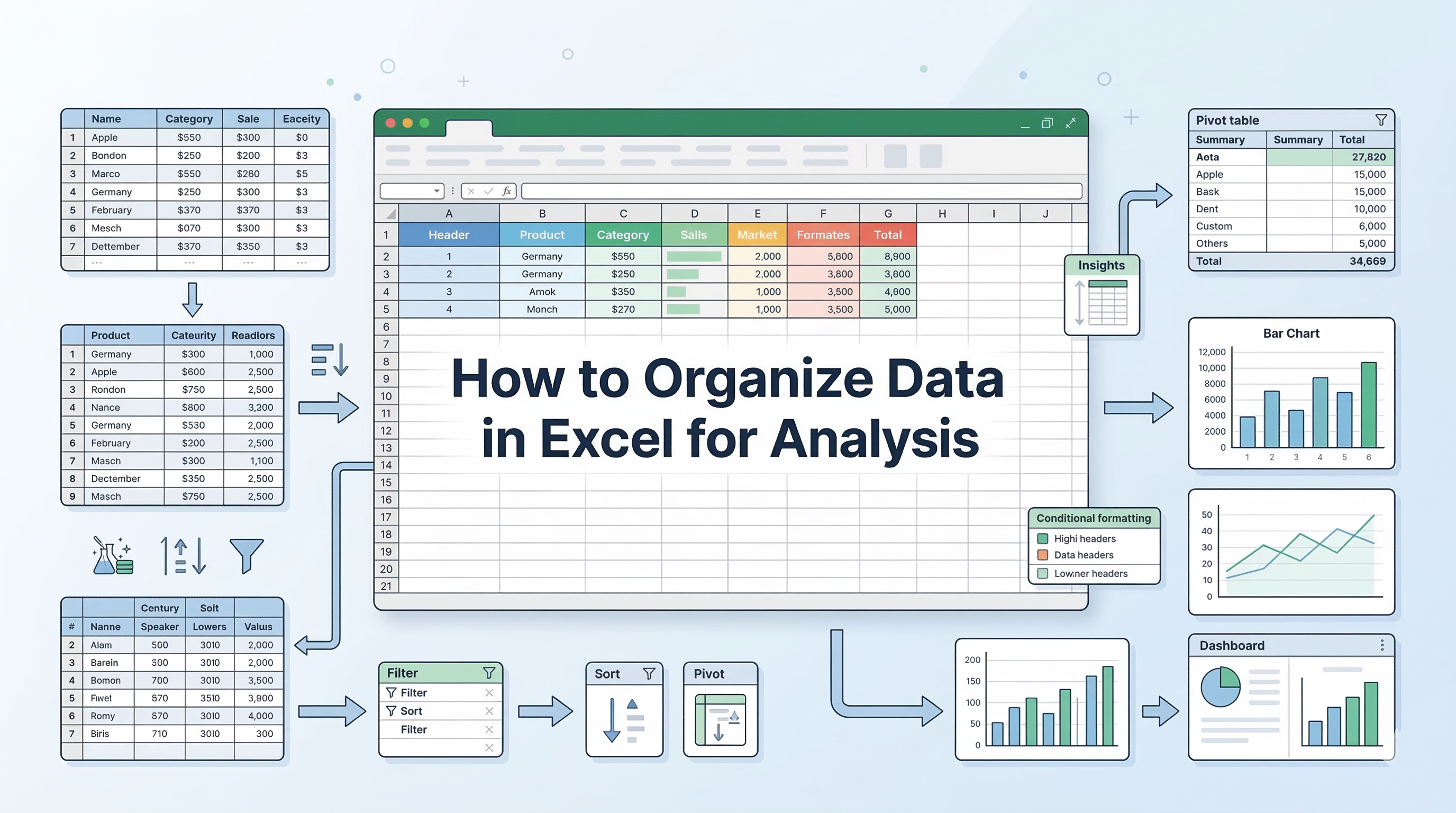
Excel is the go-to tool for data analysis, trusted by professionals across industries for its versatility and power. From organizing datasets to uncovering trends and creating meaningful reports, Excel equips you with the skills to turn numbers into insights.
In this guide, we’ll show you how to learn Excel for data analysis, covering different strategies and practical steps, helping you to build your expertise from the ground up
Structured Learning: Ways to Master the Skill
To truly understand how to use Excel for data analysis, you need a mix of theoretical knowledge and hands-on application. Here are effective paths to take:
1. Enroll in Specialized Courses
While self-learning through tutorials can help you understand formulas, structured courses provide a systematic progression from foundational spreadsheet skills to analytical thinking and business reporting.
The right curriculum not only teaches features but also demonstrates how Excel is applied in real-world decision-making. Here are some selected courses to get you started with your learning goals:
- Data Analytics using Excel
Ideal for beginners, this course focuses on building strong fundamentals. It typically covers data cleaning techniques, essential formulas, logical functions, VLOOKUP/XLOOKUP, PivotTables, and basic dashboards. The emphasis is on transforming raw data into structured, meaningful summaries.
- Master Data Analytics in Excel
Designed for intermediate learners, this program moves beyond basic spreadsheet operations into Exploratory Data Analysis (EDA), scenario analysis, and business problem-solving. Guided case studies in industries such as e-commerce and aviation help learners understand how Excel supports forecasting, trend analysis, and performance tracking.
Learn Excel for powerful data analysis and enhance your skills for better decision-making.
By choosing courses aligned with your career objectives, whether in analytics, finance, operations, or marketing, you ensure that your Excel skills evolve from basic data handling to strategic analysis. The key is not just learning features, but understanding how to apply Excel as a problem-solving and decision-making tool.
2. Work on Real-World, Outcome-Driven Projects
Learning Excel becomes significantly more effective when tied to a tangible outcome rather than isolated feature practice. Instead of focusing on individual functions, define a business question and build your spreadsheet around solving it.
For example:
- Create a monthly sales dashboard that tracks revenue growth, region-wise performance, and product contribution.
- Build a personal finance tracker with automated expense categorization and forecasting.
- Develop an HR attrition analysis sheet that identifies trends using pivot tables and trendlines.
- Construct a marketing ROI calculator that compares campaign performance using scenario analysis.
When you work on projects like these, you naturally encounter practical challenges—data cleaning inconsistencies, formula inefficiencies, scaling issues, and visualization clarity. Solving these problems strengthens your understanding of:
- Logical structuring of data tables
- Efficient formula layering
- Performance optimization for large datasets
- Turning raw data into decision-ready insights
Project-based learning trains you to think like an analyst rather than a spreadsheet operator. The focus shifts from “Which formula should I use?” to “What insight am I trying to extract?”
3. Leverage AI-Assisted Learning
In 2026, learning Excel is no longer limited to manuals and static tutorials. AI-powered tools such as Microsoft Copilot and ChatGPT have become practical learning companions, especially for data analysis workflows.
Instead of passively watching tutorials, you can use AI interactively to:
- Break down complex formulas: Ask AI to explain nested IF statements, INDEX-MATCH combinations, or dynamic array functions step by step.
- Simulate real-world datasets: Generate mock sales, financial, or marketing datasets to practice cleaning, sorting, and modeling.
- Debug spreadsheet errors: Paste formulas and error messages to understand logical mistakes and optimization techniques.
- Design predictive logic: Learn how to structure trendlines, moving averages, regression models, and forecasting sheets using built-in Excel tools.
- Refine prompts for analytical depth: Instead of asking, “How do I analyze this data?”, ask, “What statistical method in Excel can identify seasonality in monthly revenue data?”
This approach transforms Excel learning from feature memorization to analytical reasoning. When you combine AI guidance with Excel’s forecasting tools, scenario analysis, and data modeling capabilities, you begin to understand not just how to perform analysis but why certain methods work for predicting future trends.
4. Reverse-Engineer Professional Templates
Another powerful method is to study and deconstruct well-built Excel dashboards. Download publicly available templates or examine reporting sheets used in finance, operations, or marketing teams.
Instead of simply using them, ask:
- How is the data structured behind the dashboard?
- Are pivot tables or structured tables driving the visuals?
- How are slicers and filters connected?
- What logic supports summary metrics and KPIs?
- How is error handling implemented?
By reverse-engineering templates, you uncover advanced techniques such as:
- Dynamic named ranges
- Data validation logic
- Conditional formatting for decision triggers
- Dashboard layout hierarchy for clarity
- Modular sheet structuring for scalability
This approach builds architectural thinking. You begin to see Excel not just as a calculation tool, but as a structured reporting system designed for clarity, automation, and executive-level decision-making.
5. Join Peer Learning Communities
One of the fastest ways to master Excel is by exposing yourself to problems you didn’t create. Peer-driven communities, such as Reddit’s r/excel, provide access to real spreadsheet challenges posted by professionals across industries.
Participating in these communities helps you:
- Analyze diverse business scenarios from payroll automation to supply chain dashboards.
- Interpret ambiguous requirements, just like in real workplace settings.
- Debug complex spreadsheets and understand edge cases.
- Learn alternative formula structures and efficiency techniques from experienced users.
- Develop structured thinking by explaining your solutions to others.
Solving someone else’s spreadsheet error forces you to read formulas critically, identify flawed logic, and reconstruct better solutions.
This mirrors how data analysis works in professional environments where datasets are messy, constraints are unclear, and stakeholders expect clarity.
Step-by-Step Example of Doing Data Analysis With Excel
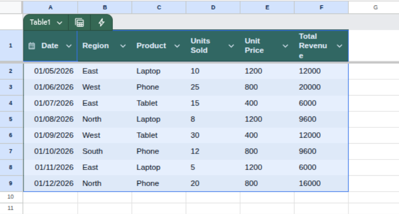
Copy the dataset provided below and paste it into cell A1 of a blank Excel workbook to follow this structured, step-by-step guide on effectively analyzing the data using Excel’s core analytical tools.
| Date | Region | Product | Units Sold | Unit Price | Total Revenue |
| 01/05/2026 | East | Laptop | 10 | 1200 | 12000 |
| 01/06/2026 | West | Phone | 25 | 800 | 20000 |
| 01/07/2026 | East | Tablet | 15 | 400 | 6000 |
| 01/08/2026 | North | Laptop | 8 | 1200 | 9600 |
| 01/09/2026 | West | Tablet | 30 | 400 | 12000 |
| 01/10/2026 | South | Phone | 12 | 800 | 9600 |
| 01/11/2026 | East | Laptop | 5 | 1200 | 6000 |
| 01/12/2026 | North | Phone | 20 | 800 | 16000 |
Step 1: Data Formatting (Setting the Stage)
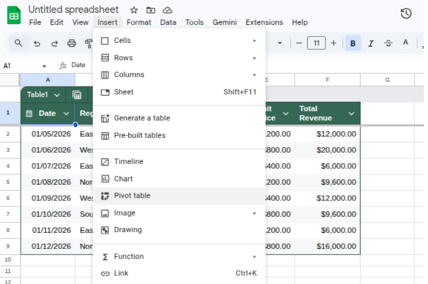
Before you analyze, you must ensure Excel recognizes your data types. This is a vital part of how to use Excel for data analysis. If Ctrl + T opens a new browser tab instead, use the ribbon: Go to the Insert tab and click Table.
- Convert to a Table: Highlight your data (A1 to F9) and press Ctrl + T. Check "My table has headers" and click OK. This turns your "flat" data into a dynamic object.
- Format Currency: Highlight the "Unit Price" and "Total Revenue" columns. On the Home tab, click the $ symbol.
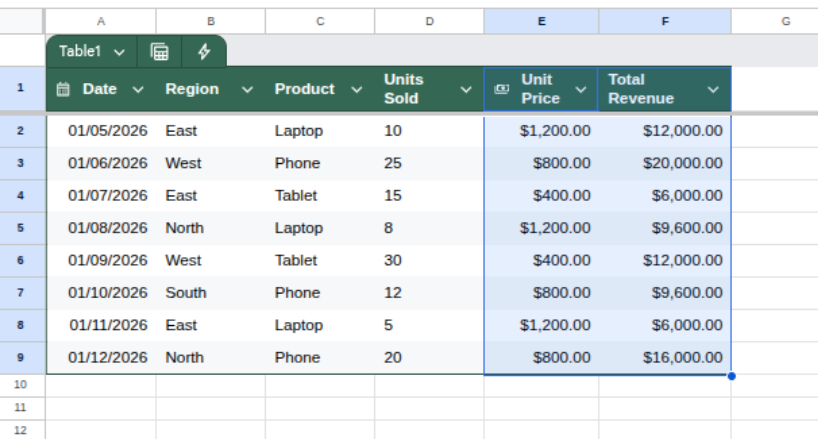
- Why do this? Tables automatically expand if you add new rows, and currency formatting prevents mathematical errors caused by reading numbers as plain text.
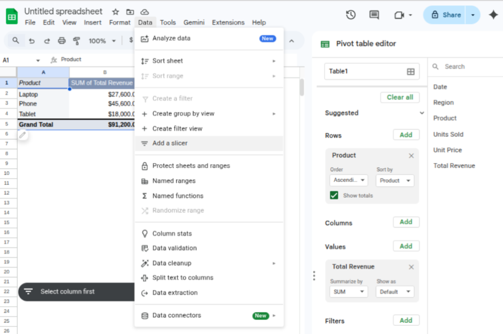
Step 2: The Core Analysis (Using PivotTables)
If you are wondering, "How do I get data analysis on Excel" quickly, the answer is always the PivotTable. It allows you to "pivot" your view to see different summaries.
Pro Tip: Instead of manually summing rows or using complex formulas, a PivotTable aggregates thousands of data points in seconds. This is where you move from "viewing data" to "finding answers."
- Click anywhere inside your new table.
- Go to Insert > PivotTable and click OK (it will open in a new sheet).
- The Layout: You will see a "PivotTable Fields" list on the right.
- Drag Product into the Rows box.
- Drag Total Revenue into the Values box.

- The Insight: Look at your sheet. You now see exactly which product is your "money maker." In this dataset, the Phone likely leads in revenue.
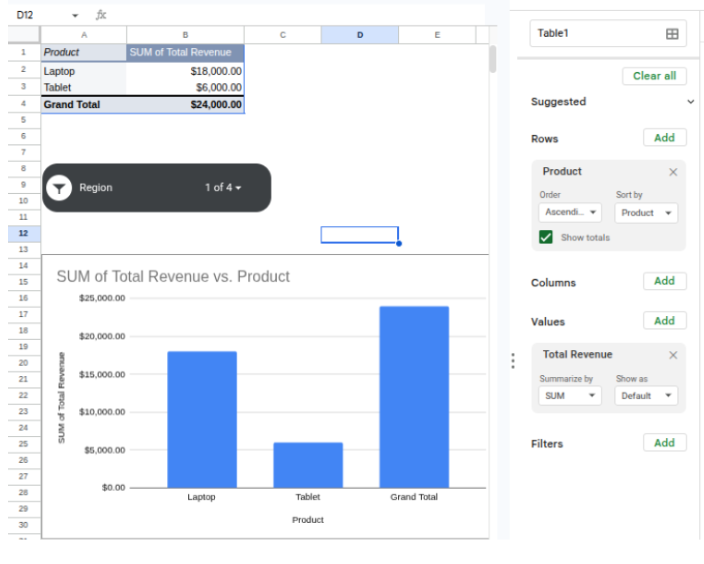
Step 3: Advanced Filtering (How to Do Data Analysis Using Excel)
To find deeper patterns, you need to add layers to your PivotTable.
- Add a Slicer: While clicking on your PivotTable, go to the PivotTable Analyze tab and click Insert Slicer. Select Region.
- The Interactive Element: A floating menu appears. Click "East." The PivotTable instantly updates to show only sales for the East region.
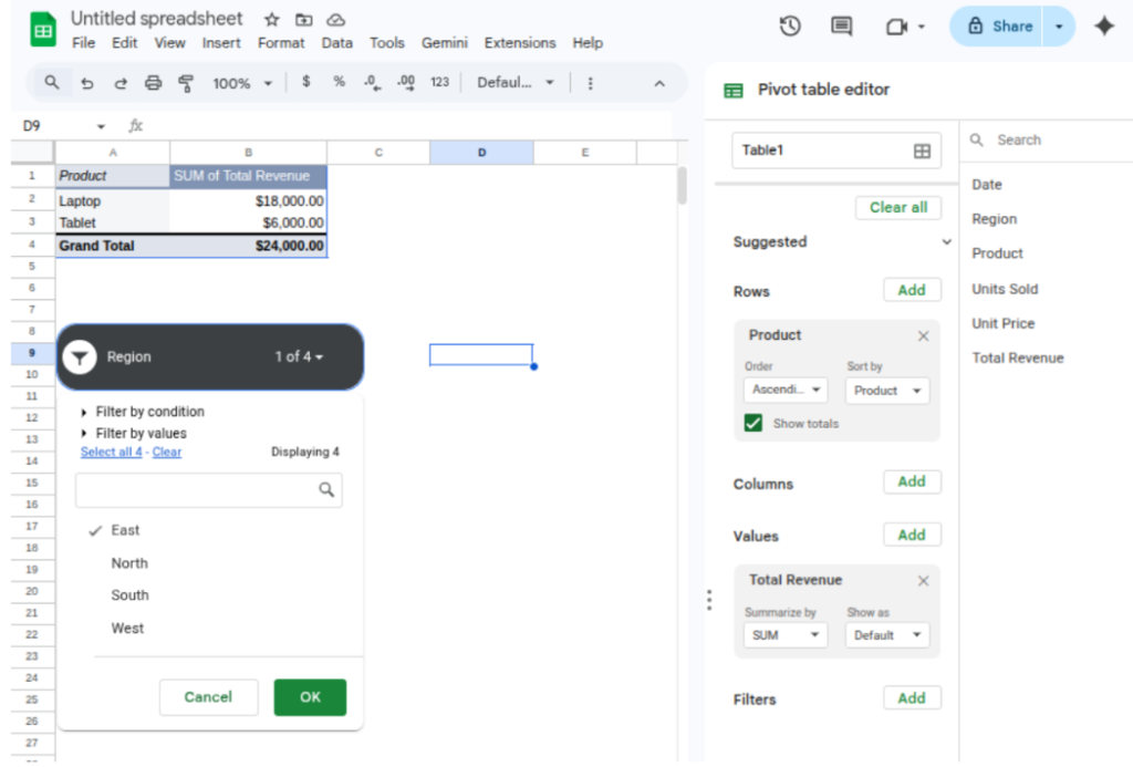
- The Discovery: You might notice that while Laptops sell well overall, they are the only thing selling in the East. This tells you where to focus your marketing.
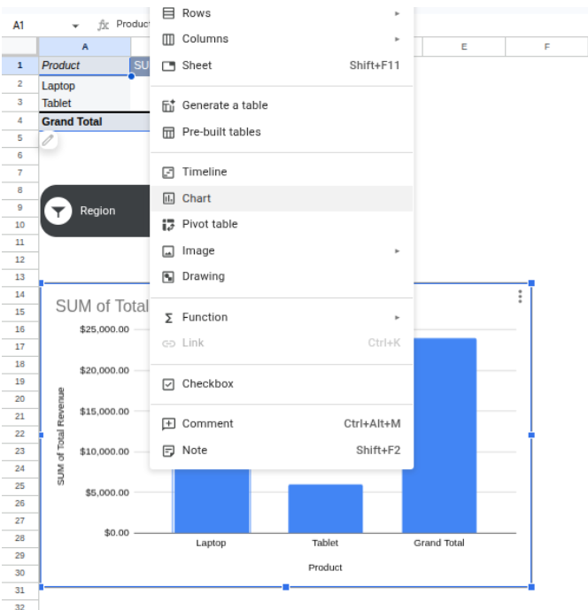
Step 4: Visualizing for Impact
Data is often better understood through shapes than numbers. This is the peak of the analysis pyramid.
- Click your PivotTable.
- Go to Insert > PivotChart and select a Clustered Column chart.
By following these steps, structuring your data, summarizing insights with PivotTables, applying filters for deeper exploration, and visualizing results, you move from simply viewing numbers to performing meaningful analysis.
This workflow reflects how Excel is used in real business environments, where analysts transform raw datasets into actionable insights that support strategic decision-making.
Summary of Core Analytical Tools
| Category | Tool/Function | Why it’s Essential |
| Data Cleaning | Remove Duplicates | Ensures your analysis isn't skewed by redundant entries. |
| Logic | SUMIFS / COUNTIFS | Allows you to sum data only if it meets multiple criteria. |
| Lookup | XLOOKUP | The modern way to find data in one table and bring it to another. |
| Reporting | Slicers | Adds interactive buttons to your charts for a dashboard feel. |
Conclusion
Mastering how to do data analysis using Excel is a gradual process of building one skill upon another.
By starting with organized data formatting and progressing to dynamic tools like PivotTables, you move from simply viewing information to actively extracting value from it. Whether you use community forums, AI tools, or structured learning paths, the goal remains the same: transforming complex datasets into clear, actionable conclusions.
Excel provides an accessible yet powerful environment for this growth, remaining a standard tool for anyone looking to make evidence-based decisions in a fast-paced professional era.