- Introduction to Pivot tables in excel
- What is a Pivot table in excel?
- How to Create a Pivot Table?
- Examples of Pivot tables
- What are pivot tables used for?
- Benefits of using Pivot Table
- Difference between Pivot table and Straight Table
- How to refresh Pivot Table?
- Free courses on Excel
Introduction to Pivot tables in excel
In today's article, we will learn about the most important feature of Excel, i.e., How to Create a pivot table in excel and how to refresh the pivot table.
Our objective is to aid you with the most basic introduction and explanation of what a Pivot Table is that you can find. You will recognize the principles of pivot tables after reading this article.
You'll understand how things work behind the scenes. You will also be upskilled in how to analyze business data.
This article is for you if you have never created a pivot table or if you have, but it feels like magic to you.
Let us first learn about what is a pivot table in excel?
What is a Pivot table in excel?
A pivot table is an essential data analysis tool. Many important business questions can be quickly answered using pivot tables. One of the reasons we create Pivot Tables is to pass data. We want to back up our story with data that are easy to understand and see. Although Pivot Tables are only tables and lack authentic visuals, they can still be used for Visual Storytelling.
A PivotTable is a powerful tool for calculating, summarizing, and analyzing data that allows you to see comparisons, patterns, and trends. PivotTables behave differently depending on the platform on which you run Excel.
A Pivot Table can be used to summarise, analyze, explore, and present summary data. PivotCharts add visualizations to the summary data in a PivotTable, allowing you to see comparisons, patterns, and trends effortlessly. PivotTables and PivotCharts both allow you to make informed decisions about critical data in your organization.
You can also create PivotTables by connecting to external data sources such as the SQL- Server tables, SQL- Server Analysis Services cubes, Azure Marketplace, Office Data Connection (.odc) files, XML files, Access databases, and text files, or by using existing PivotTables.
Mastering pivot tables may appear to be complicated. However, with a few basic principles, you can grasp them quickly. You will quickly catch up to your more advanced colleagues in this area. And, of course, you will increase your value on the job market.
So far, we've been speaking in broad strokes, with no specific tool. You can apply your new skills in any tool your company uses, including Microsoft Office, Libre Office, Open Office, Google Sheets, and many others. Let's look at how the Pivot Table settings appear in the most popular tools so you're familiar with them and ready to use them immediately!
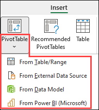
To create a Pivot Table in most tools, highlight the sheet region and click a function (usually in the Data menu). Consider using Microsoft Office as an example.
There is a function in Microsoft Office named Ideas that can even suggest some basic Pivot Tables based on what is constructed on the current sheet. This can be an excellent point to start.
How to Create a Pivot Table?
Here is the Step By Step Guide to creating a pivot table
- Step1: In Excel for Windows, make a PivotTable.
- Choose the cells from which you want to create a PivotTable
- Go to Insert Option and click on Pivot Table
- Select the location for the PivotTable report.
- At last, click on the OK option.
- Step2: Creating Pivot Table from different sources.
- Step3: Create your own Pivot Table by using the given data.
- To add a field to your PivotTable, check the box next to the field name in the PivotTables Fields pane.
- Drag the field to the target area to move it from one area to another.
In Excel for Windows, make a PivotTable.
- Choose the cells from which you want to create a PivotTable. Please keep in mind that your data should be organised in columns with a single header row.
- Go to Insert Option and click on Pivot Table.

- Based on an existing table or range, this will generate a PivotTable.

- Take note: Choosing and adding the given data to the Data Model will insert the table or range used for this PivotTable into the workbook's data model.
- Select the location for the PivotTable report. Choose New Worksheet to insert the PivotTable into a new worksheet or Existing Worksheet and specify where you want the PivotTable to appear.
- At last, click on the OK option.
Creating Pivot Table from different sources
- You can choose from other possible sources for your PivotTable by clicking the down arrow on the button.
- In addition, to make use of an existing table or range, you have three other options for populating your Pivot Table.
- Note: Depending on your organization's IT settings, your organization's name may appear on the button. "From Power BI (Microsoft)," for example.
Creating your own Pivot Table by using given data
To add a field to your PivotTable, check the box next to the field name in the PivotTables Fields pane.
Note that selected fields are added to their default areas: non-numeric fields to Rows, date and time hierarchies to Columns, and numeric fields to Values.

Drag the field to the target area to move it from one area to another.
Examples of Pivot tables
Let us look at some examples where we can use the Pivot table.
Create a list of unique values using a pivot table. Because pivot tables summarise data, they can be used to locate distinct values within a table column. This is a quick way to see all the values in a field and find typos and other inconsistencies.
A pivot table can do things like
- group items/records/rows into categories
- count the number of items in each category
- sum the item values or compute the average
- find the minimal or maximal value, and so on.
We'll see how pivot tables work in a few simple steps. Then, creating pivot tables will no longer be difficult.
What are pivot tables used for?
The following vital point to remember about pivot tables is why we use them.
A Pivot Table is a user-friendly tool for quickly summarizing a big size of data. A PivotTable can be used to analyze numerical data in-depth and answer random questions about your data. A PivotTable is beneficial for:
- If you have a large size, data can be queried in a variety of user-friendly ways.
- Numeric data subtotaling and aggregation, data summarization by categories and subcategories, and custom calculations and formulas.
- Expanding and collapsing data levels to focus your results, as well as drilling down to details from summary data for areas of interest to you.
- If you want to see different summaries of the source data, move rows to columns or columns to rows (or "pivot").
- Various features include filtering, sorting, grouping, and conditionally formatting. The most valuable and exciting subset of data allows you to concentrate on only the information you need.
- Concise, attractive, and annotated reports can be presented online or in print.
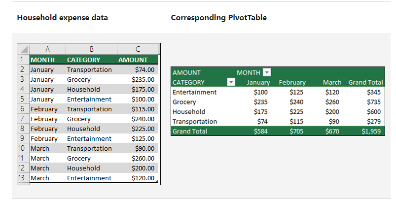
For example, on the left is a simple list of household expenses, and on the right is a PivotTable based on the list:
Benefits of using Pivot Table
Here are quite a few of the advantages and benefits of using Pivot Tables:
Pivot Tables are simple to use.
One significant advantage of pivot tables is their ease of use. Everyone can find it simple to summarise collected data. It's as simple as dragging the columns to different table sections. The columns can also be rearranged and moved as desired by any user with the click of a button.
Pivot tables can generate real-time data.
Another essential feature of a pivot table is its ability to generate data in real-time. Whether a user enters equations directly into the pivot table or relies on formulas, this instrument can generate instant or immediate data. And using this tool, a user can quickly compare the information. It is as simple as creating columns on tables and dragging and dropping desired information to compare. This is especially useful if a pivot table user is short on time.
The Pivot Table facilitates data analysis.
Data analysis is much easier with pivot tables. Users will benefit from its use by being able to handle large amounts of data and analyze them more quickly. Pivot tables permit you to take a large data size and work with it so that you only need to see a small number of data fields. This will significantly facilitate the analysis of large amounts of data. Furthermore, pivot tables enhance the data analysis experience. It is now more interactive. The tables allow the user to easily drag and drop data, making the data table interactive. This is a critical tool for quick and efficient work with Microsoft Excel.
A pivot table simplifies data summarization.
Pivot tables can be extremely useful for quickly and easily summarising data. It will help any user create a summary from a large amount of disorganized data in the form of rows and columns. This tool allows you to condense large amounts of information into smaller amounts. Furthermore, the data can be summarised in a straightforward format that anyone can understand. With this tool, users can label and sort rows and columns in any way they want, and data can be arranged according to their needs and how they want it to be presented. Most importantly, pivot tables make it easier to segment data analytics collected in a spreadsheet or database.
A pivot table can help you find data patterns.
Forecasting is critical in any management, whether in business or in any organization. Excel pivot tables can help any user create customized tables from large data groups in this task. And manipulating data in this manner will aid in the discovery of recurring patterns in the data. This, in turn, will aid in accurate data forecasting. A pivot table generates accurate reports more quickly. Another essential feature of pivot tables is that they can assist any user in efficiently and reliably creating or formulating reports and demonstrations. It will fend off any user from manually creating reports. That means more time for other tasks and activities. Furthermore, a pivot table user can include links to external sources, if any, in their report, making reports and presentations more efficient and convincing. A pivot table is one of the few tools available to users for gaining a deeper understanding of analytics data. This tool can generate multiple reports from the same collected data contained in a single file.
It would keep you away from 'cut and paste' and require you to take more steps to get to the data that a user needs. Remember that in today's world, information is currency, and the faster you can acquire it, the better.
Pivot tables can assist in making faster decisions.
With the modern world's fast-paced demand, quick decision-making is critical. This is incredibly accurate for business owners and executives. A pivot table can be a valuable tool in this regard. It saves a significant amount of time. It is a very valuable reporting tool because it allows users to analyze data and make decisions without much difficulty quickly. This is exceptionally useful in the business world, where making precise and timely decisions in a short period is critical.
Difference between Pivot table and Straight Table
The distinction between a straight table and a pivot table
Table Pivot
The pivot table displays dimensions and expressions as tables. There is no formal restriction on the number of dimensions or expressions that can be used. A pivot table can be defined without using expressions, resulting in a tree view for navigating the dimension levels.
Straight table
The straight table differs from the pivot table in that it does not support subtotals, and the dimension grouping is displayed in record form, with each row of the table containing field and expression values.
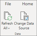
How to refresh Pivot Table?
- When you add new data to a PivotTable data source, all PivotTables built on that data source must be refreshed.
- To refresh only one PivotTable, right-click anywhere in the PivotTable range and choose Refresh.
- If you have multiple PivotTables, first select any cell in any PivotTable, then go to PivotTable Analyze on the Ribbon > click the arrow under the Refresh button and select Refresh All.
Free courses on Excel
- Excel for beginners
- Excel Tips and Tricks
- Excel Regression Analysis
- VLOOKUP in Excel
- Data Analytics using Excel
- Conditional Formatting in Excel
Conclusion
A pivot table in excel is not, as some may believe, cheating or a false or incorrect method of data management. It is a fantastic tool for faster, easier, and more reliable data collection, analysis, sorting, summarising, report and presentation creation, and assisting any user in making more reliable decisions. This is how we can create interactive reports in Excel using the Pivot table feature. A pivot table is an excellent tool if you enjoy experimenting with data sets. Just keep exploring the distinct features of the Pivot table to get a good understanding. Learn more such Excel tips and tricks today with us!