- Introduction
- What is responsive design?
- Performance-Oriented Approach
- Building Blocks of Responsive Web Design
- How to design responsive web pages?
- How to create a better responsive web design with ease?
Introduction
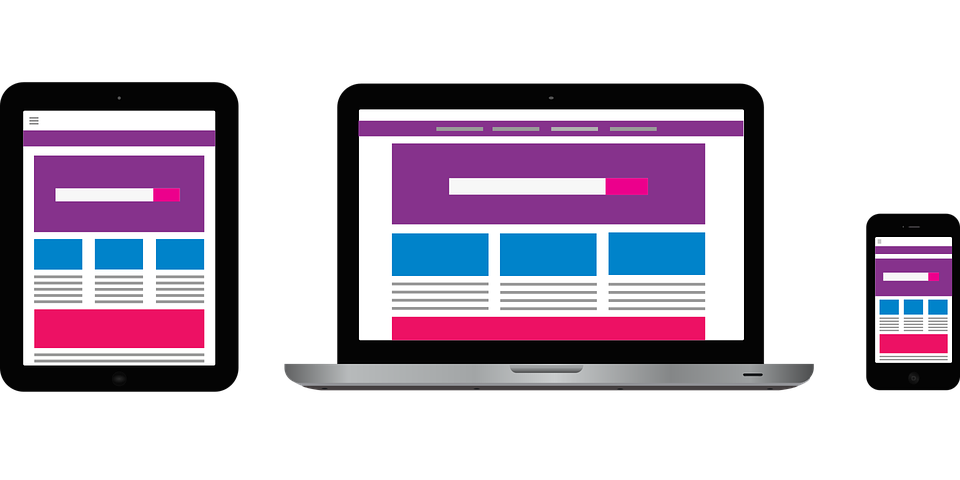
Ever wondered how a user using multiple devices such as desktops, laptops, mobiles, iPads which are running on different OS, having different screen sizes aka viewports, are able to access the websites or applications on these devices. Isn’t it surprising, how the same content and CSS are rendered perfectly by determining the page’s layout on all the devices with different screen viewports?
Thanks to the incredible advent of technology. The mobile market exploding unprecedentedly and the pandemic escalating from offline to online mode of working, be it business or education, triggered the prime focus on the need of giving the best user experience irrespective of the devices being used. That’s where responsive web design comes into the picture.
Birth of fluid design and Liquid design/history of fluid design and liquid design
The desktop screens were 800 or 1024 pixels wide during the initial web development phase, so the websites were designed for these two screen sizes. The width and height of the images were kept fixed and did not change with different screen sizes. Gradually people could choose from multiple different screen sizes, and the fixed-width layout became distinct. In the early 2000s, developers created ‘fluid design’ and ‘liquid layout’ to fix the problems faced with fixed-width design.
The users found these designs difficult for the websites to have a smooth transition from desktop to mobile mode. In order to access ‘real’ websites, mobile users had to squeeze and zoom and scroll to navigate websites designed for large screens. Every time the user tried to zoom in or out, websites used to take a longer time to load the web pages. Mobile web browsing wasn’t worth the effort as, accidentally, if the user did a wrong click on the web page, they had to wait for the page to start uploading from the start. With the problems faced by the user the eagerness to develop something that’s more responsive and engaging to the users was on priority.
What is responsive design?
Now, what are these Responsive Websites? Responsive design is a web development approach to creating dynamic changes to the appearance of web pages based on the user device’s viewport. A graphic user interface (GUI) design approach is used to create content that adjusts smoothly to various screen sizes.
Performance-oriented approach
An excellent/responsive design for any website can be key to the growth of your business. It can immensely improve the overall user experience, which results in more web traffic and hopefully more leads. Mobile web traffic has overtaken desktop traffic. One way to maximize the user experience of your website is by responsive web design; if you choose to advertise on social media or youtube SEO, a large amount of traffic comes from mobile users. If landing pages are optimized and easy to use will lead to easy ROI for your marketing advertisements.
Building Blocks of Responsive Web Design
Now that the benefits of responsive website design are discussed, the quality of design matters too and adapting content to the screen size,but providing a consistent user experience across platforms adds to the quality as well.
Effective website layouts are like puzzles in which clusters of small pieces need to be carefully arranged. With the choice of the right parts, you can build a website that will provide the audience with a better user experience.
So, let’s have a look at the building blocks of awesome responsive web pages.
- HTML and CSS:
The most common building block of any web development is HTML and CSS. The basic support of responsive design is a combination of HTML for structure and CSS for the design of the webpage.
- Media Queries:
We can make websites responsive with a CSS3 technique called Media Queries that lets you render media by adapting to different screen sizes. It is similar to an if clause of any programming language. A media query checks if a screen’s viewport is wide enough or too small while executing appropriate code.
In the above example, if the screen is 600 px wide, img-full class images will take up 75% of the screen and auto helps in automatically centering the image element by equally wide margins.
- Fluid Layouts:
It is an essential component of today’s responsive design. In the initial days of developing websites, images were set with a static value for every HTML element size, 500px. A fluid layout depends on dynamic values like the percentage of the viewport, which dynamically increase or decrease the container element size of the HTML element based on the size of the screen. Fluid is a percentage-based layout. Many web developers and designers feel that fluid layouts are not that dynamic.
- Flexbox Layout:
It is a CSS module design. It is said to be more efficient in laying out multiple elements, even if the content size inside the container element is not known. Flex container enlarges or collapses the container’s content and prevents them from overflowing. Flexbox has many properties, but using flexbox can be a little complicated compared to other ways of creating a responsive webpage. But the basic idea for the design of web pages is indeed taken from the flexbox concept.
- Responsive Images:
It uses the concept of fluid layout, i.e., dynamically controlling the width and height of the image. In CSS, we can execute it with the help of assigning the width attribute using % unit, say, for example, width:90%. This will give only one single-width and height of the screen’s viewport and have restrictions regarding different screen resolutions.
For different devices, we can use the srcset attribute of the HTML image element, which helps us specify more than one-page size to choose from.
How to design responsive web pages?
Let’s define the different ways in designing a responsive web page. We have already discussed the building blocks to make the web page responsive. In responsive web design, you are actually designing the flexibility feature for images, text and layouts. So, you should start considering the below:
- Set Your Media Query Ranges (Responsive Breakpoints)
Breakpoints are the width of the screen, and setting the media query ranges based on the design will help in creating a responsive webpage
- Size Layout Elements with Percentages or Create a CSS Grid Layout
Firstly, set up different sizes for different layout elements depending on the media query or screen breakpoint.
Second, having a layout for the container element. The number of layout containers will depend on the design, but most websites focus on the elements listed below:
- Wrapper or Container
- Header
- Content
- Sidebar
- Footer
- Implement Responsive Images
Responsive images using a dynamic value for all pictures.
- A responsive print style for Your Website Text
The prime focus of responsive web design is to provide excellent responsiveness to the contents of the layout blocks, elements, and media. Text font size must be matched with the screen resolution. The easiest way to implement this is to set a static value for font size, like 18 px, and accommodate it in each media query.
- CSS Units and Values for Responsive Design
CSS has both relative and absolute units of measurement. An example of an absolute unit of length is a centimetre (cm) or a pixel (px). Relative units or dynamic values depend on the size and resolution of the screen or the font sizes of the root element.
- PX vs EM (ephemeral unit) vs REM (root em) vs Viewport Units for responsive design
- PX – a single pixel
- EM – relative unit based on the font size of the element.
- REM – relative unit based on the font size of the element.
- VH (viewport height), VW(viewport width) – % of the viewport’s height or width.
- % – the percentage of the parent element.
How to create a better responsive web design with ease?
To create a responsive web design, one must have a basic understanding of HTML and CSS. Without a basic understanding of HTML and CSS, it can be easy to make mistakes. Looking to learn web design? Check out these free web design courses! These courses will teach you the basics of web design and help you create beautiful, responsive websites. You can also take up a Free graphic design course that will help you enhance your knowledge.
While building a responsive web page, the main aim is speed, i.e., the loading speed must always be a priority. Your approach in designing the responsiveness for a web page must not block or delay your page’s initial render any more than it needs to.
There are several ways you could make your pages faster. A few of the great ideas you should consider are:
- Take the “mobile first” approach:
In this you need to scale up phone-sized designs to suit larger screens. Your design must be as natural as desktop equivalents, and need to adapt to smaller screens without causing cramping and confusion.
- Create fluid grids and images:
Always create images in their actual dimensions. If you have space requirements then you can crop them to maximize impact. Using Scalable Vector Graphics (SVGs) is also a great idea to add graphics, which will support interactivity and animations.
- Include three or more breakpoints (i.e., design for 3+ devices).
Prioritize and hide content to suit users’ contexts. Check your visual hierarchy and use progressive disclosure and navigation drawers to give users needed items first.
- Aim for minification.
Focus on accessibility with font sizes/styles. Use contrast and background effectively. Make sure the headlines are at least 1.6 times bigger than the body text.
Few more points to remember during creating of responsive web design include:
- Optimizing your images,
- avoiding render-blocking JS, and
- implementing caching,
- using a more efficient CSS layout,
- minification,
- improving your critical rendering path are all
There are basic building blocks such as fluid layout, flexbox layout, responsive image, CSS grid layout, etc. Testing the sample code to make sure your responsive website has no significant issues would be a good idea to achieve and build responsive web pages.
Analyze and re-invent
But by familiarizing yourself with the different building blocks, analyzing the examples with web dev tools, and testing as you build the sample code, you should be able to make your website responsive without any significant issues.
If that sounds too much to achieve, you can always hire a WordPress developer or make sure your theme is already responsive.
Conclusion
Responsive websites are the process of adapting to all screen sizes and resolutions, not only on desktops but also on mobile, tablets, and sometimes even TV. Overall, responsive design is a dynamic and low-cost reasonable approach, but it’s “easy” nature is ambiguous. You can still land into difficulties if you use it without caution as the design depends on the kind of application you are building.


